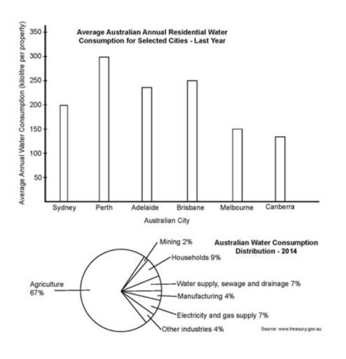
The bar chart below shows the average Australian water consumption in selected cities for last year. The pie chart shows the distribution of Australian water consumption for last year
A full IELTS Academic Writing Task 1 answer to this mixed / multiple charts at Band 6.0, 7.0, 8.5, with the four-part structure, the comparison language it needs, and why each version scores what it does.
The question
You should spend about 20 minutes on this task.
The bar chart below shows the average Australian water consumption in selected cities for last year. The pie chart shows the distribution of Australian water consumption for last year.
Summarise the information by selecting and reporting the main features, and make comparisons where relevant.
Write at least 150 words.
Average residential water consumption in six Australian cities, and the distribution of Australian water consumption by sector, 2014.
What to select from this mixed / multiple charts
Two charts that answer different questions, and the mistake is treating them as one. The bar chart compares cities on household use; the pie chart shows that households are only 9 per cent of national consumption while agriculture takes two thirds. Putting those two facts side by side is the strongest thing you can do here — the city differences are real, but they concern a small slice of the total.
Structure
Introduction — Paraphrase both charts and note that they measure different things — one residential use by city, one national use by sector.
Overview — No figures: household consumption varies considerably between cities, but households account for a small share of national water use, which is dominated by agriculture.
Body 1 — The bar chart — the range from Perth down to Canberra, grouped rather than listed.
Body 2 — The pie chart — agriculture's dominance and how small the household share is by comparison.
Model answers
Band 6.0 model answer
180 words
The bar chart shows how much water an average property used in six Australian cities last year, and the pie chart shows which sectors used the water in Australia in 2014.
Perth used the most water, about 300 kilolitres for each property. Brisbane was the second with about 250 kilolitres and Adelaide the third with about 237. Sydney used about 200 kilolitres.
Melbourne and Canberra used much less water than the other cities. Melbourne used about 152 kilolitres and Canberra only about 135, which is less than half of Perth.
The pie chart shows that agriculture used most of the water in Australia, 67 per cent. Households used only 9 per cent, and water supply, sewage and drainage used 7 per cent. Electricity and gas supply was also 7 per cent.
Manufacturing and other industries were both 4 per cent, and mining was the smallest with only 2 per cent.
In conclusion, Perth used much more water than Canberra, but all the households together used only a small part of the water in Australia because agriculture used most of it.
Why this is Band 6.0
Both charts are covered with accurate figures, which secures Task Achievement at this level.
The charts are described one after the other and the relationship between them is only touched on at the end.
Vocabulary is adequate but repetitive: water, city and per cent recur throughout.
Sentences are mainly simple and compound, with figures presented one per clause.
Band 7.0 model answer
205 words
The bar chart shows average annual residential water consumption per property in six Australian cities, while the pie chart gives the distribution of total Australian water consumption by sector in 2014.
Overall, residential consumption varied considerably between cities, with Perth using more than twice as much per property as Canberra. However, the pie chart puts this in perspective: households accounted for less than a tenth of national water use, which was overwhelmingly dominated by agriculture.
The six cities fall into two groups. Perth was clearly the heaviest user at approximately 300 kilolitres per property, followed by Brisbane at around 250 and Adelaide at about 237, with Sydney somewhat lower at 200. Melbourne and Canberra formed a distinctly lighter-using pair, at roughly 152 and 135 kilolitres respectively — the Canberra figure being less than half that of Perth.
The sectoral picture is far less balanced. Agriculture alone consumed 67 per cent of Australia's water, more than seven times the household share of 9 per cent. Water supply, sewage and drainage and electricity and gas supply each took 7 per cent, while manufacturing and other industries accounted for 4 per cent each and mining for only 2 per cent. Every non-agricultural sector was therefore in single figures.
Why this is Band 7.0
The overview is separate, arrives early and connects the two charts by noting that households are only a small share of the total.
Cities are grouped by level rather than listed one by one, which is proper selection.
The small pie segments are grouped and dismissed together rather than reported individually.
Less common lexis is used accurately: residential, accounted for, negligible, by contrast.
Band 8.5 model answer
249 words
The bar chart compares average annual residential water consumption per property across six Australian cities, while the pie chart shows how total national water consumption was divided between sectors in 2014. The two therefore measure different quantities, and are best read together.
Overall, household consumption differed markedly from city to city, with the heaviest user consuming more than double the lightest. Nationally, however, households represented under a tenth of all water used, agriculture alone taking roughly two thirds.
Among the cities, Perth stood clearly apart at approximately 300 kilolitres per property, ahead of a middle group comprising Brisbane at around 250, Adelaide at about 237 and Sydney at 200. Melbourne and Canberra formed a noticeably lighter pair at roughly 152 and 135 kilolitres, so the gap between the extremes exceeded 160 kilolitres — Canberra using under half of Perth's figure despite both being state or territory capitals.
The sectoral distribution is far more lopsided. Agriculture accounted for 67 per cent of consumption, more than seven times the residential share of 9 per cent and greater than every other sector combined. The remainder was thinly spread: water supply, sewage and drainage and electricity and gas supply took 7 per cent each, manufacturing and other industries 4 per cent each, and mining just 2 per cent, so no non-agricultural sector reached double figures. Read alongside the bar chart, this indicates that the substantial differences between cities apply to a category responsible for only a small fraction of Australia's total water use.
Why this is Band 8.5
The overview relates the two charts to each other rather than summarising them separately, which is the key move on a two-chart task with different units.
Groups the cities and groups the minor sectors, spending words on comparison instead of on listing.
Draws the inference the charts jointly support — that variation between cities concerns a small fraction of national use — without going beyond the data.
Lexis is precise and economical: residential, dominated, in single figures, an order of magnitude, fraction.
Complex structures are used flexibly, including a fronted concessive, an appositive and a participle clause, with figures embedded naturally.
Model answers written and reviewed by The English All-in-One IELTS team. They are teaching models showing what each band looks like, not real candidate scripts.
This is a mixed / multiple charts question. The answers above show you what each band looks like when it is finished. What they cannot show you is how to get there from a blank page in forty minutes.
That is what our Writing Study Library is for: the structure we teach for this exact question type, the paragraph pattern that goes with it, and the sentence openers for each stage — so the essay is planned before you start writing rather than assembled as you go.
How do I handle two charts that measure different things?
Say so in the introduction, then give each its own paragraph and use the overview to relate them. Here one chart is about homes in six cities and the other about the whole country by sector, so treating them as a before-and-after would produce nonsense.
Can I draw a conclusion from combining the two charts?
You can point out what they jointly show — that the city differences concern a category which is only 9 per cent of national use. That is arithmetic from the two charts, not speculation. What you must not do is suggest policy or explain why agriculture uses so much.
Should I list every segment of the pie chart?
No. Report agriculture and households, then group the rest: "no other sector reached double figures". Six small segments listed individually consume your word count and demonstrate no selection.
The bar chart says 'last year' with no date — does that matter?
Only in that you should paraphrase it as given rather than inventing a year. Write "last year" or "in the year shown". Supplying a date the chart does not state would be an accuracy error.