
IELTS Writing Task 1 — 41 charts with model answers
Every question below shows the original visual and a full model report at three band levels, with the structure and comparison language each one uses. All free.
By chart type
All questions
 Line graph
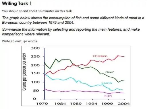
The graph below shows the consumption of fish and some different kinds of meat in a European country between 1979 and 2004
 Line graph
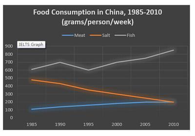
The graph below shows the changes in food consumption by Chinese people between 1985 and 2010
 Bar chart
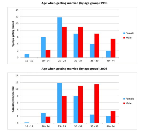
The charts below give information on the ages of people when they got married in one particular country in 1996 and 2008
 Pie chart
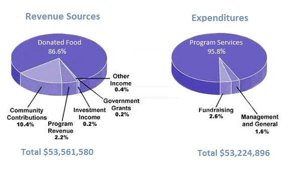
The pie chart shows the amount of money that a children’s charity located in the USA spent and received in one year
 Pie chart
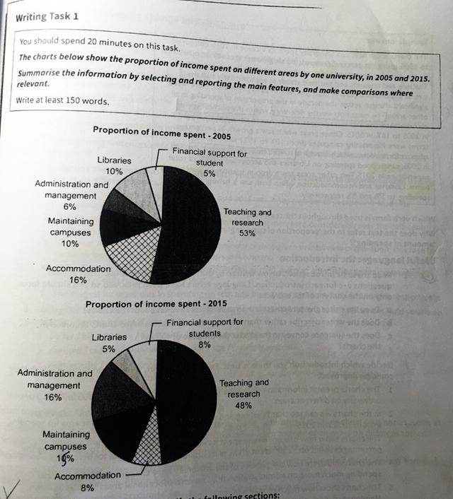
The chart below show the proportion of income spent on different areas by one university, in 2005 and 2015
 Bar chart
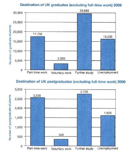
The charts below show what UK graduate and post graduate students who did not go into full-time work did after leaving college in 2008
 Bar chart
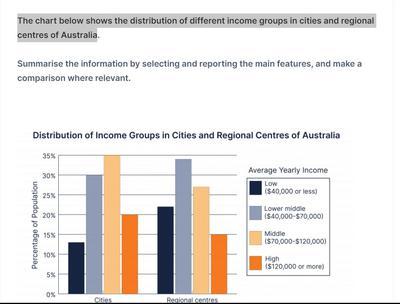
The bar chart depicts the distribution of income groups, namely low (40,000 dollars or less), lower middle (40,00 - 70,000 dollars), middle (70,000 - 120,00 dollars), and high (120,000 dollars or more) in the cities and the regional centers of Australia
 Bar chart
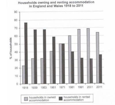
The given bar chart illustrates how many households owned and rented places in England and Wales during the period of 93 years
 Table
Table
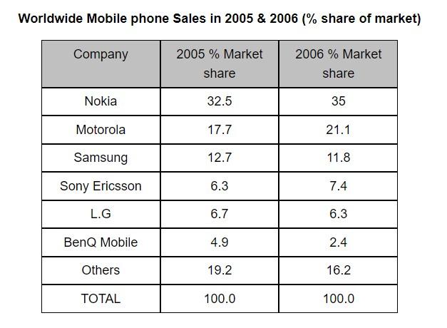
The table shows the worldwide market share of the mobile phone market for manufactures in the years 2005 and 2006
 Mixed / multiple charts
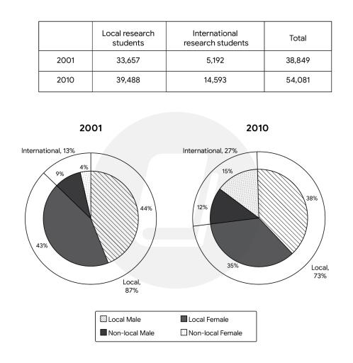
The table below shows the number of research students in Australian universities in 2001 and 2010
 Bar chart
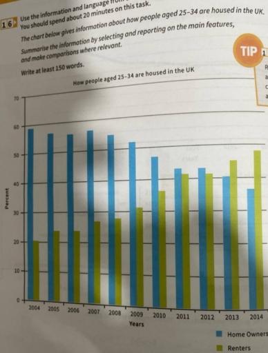
The chart below gives information about how people aged 25 - 34 are housed in the UK
 Line graph
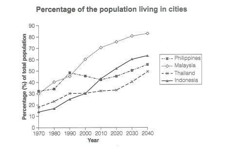
The graph below gives information about the percentage of the population in four Asian countries living in cities from 1970 to 2020, with prediction for 2030 and 2040
 Table
Table
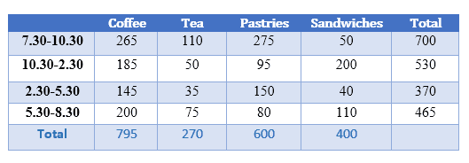
The table below shows the sales made by a coffee shop in an office building on a typical weekday
 Mixed / multiple charts
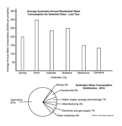
The bar chart below shows the average Australian water consumption in selected cities for last year. The pie chart shows the distribution of Australian water consumption for last year
 Table
Table
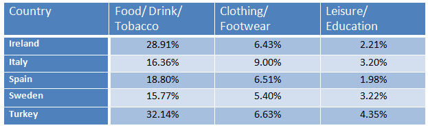
The table below gives information on consumer spending on different iters in five different countries in 2002
 Map
Map
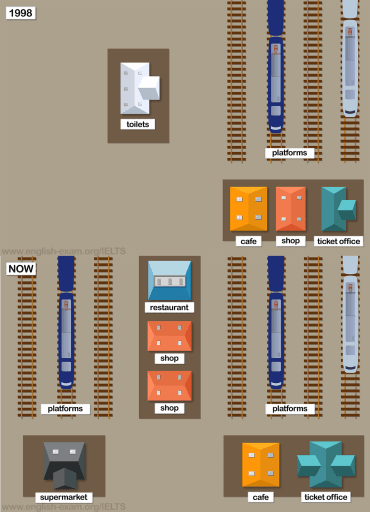
The maps show Pacific Railway Station station in 1998 and now
 Pie chart
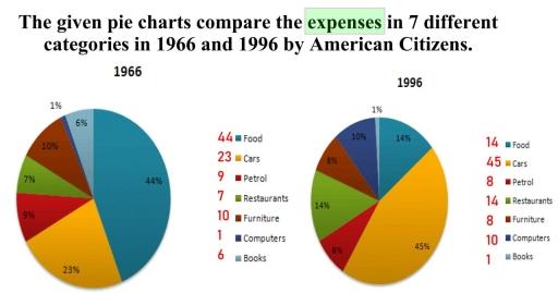
The given pie charts compare the expenses in 7 different categories in 1966 and 1996 by American Citizens. Write a report for a university lecture describing the information below
 Bar chart
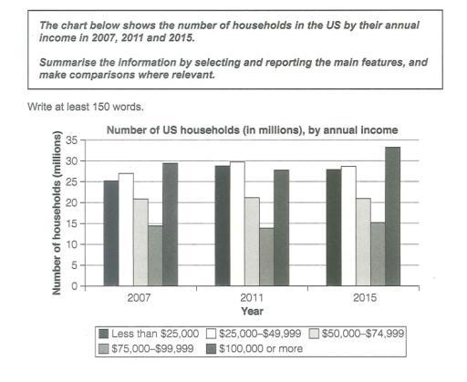
The chart below shows the number of households in the US by their annual income in 2007, 2011 and 2015
 Table
Table
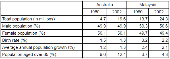
The table below gives information about population in Australia and Malaysia in 1980 and 2002
 Table
Table
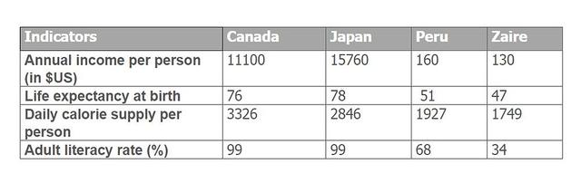
The table below shows social and economic indicators for four countries in 1994, according to United Nations statistics
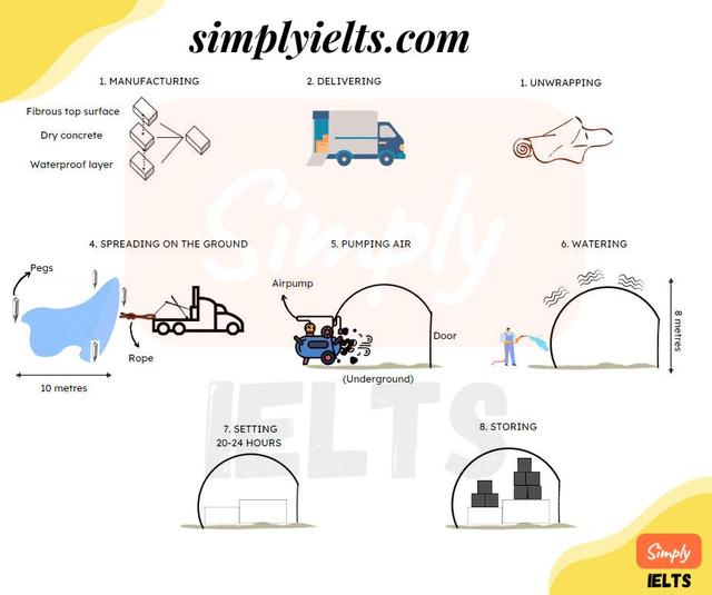 Process diagram
The diagram shows a process of making a storage area from a material called concrete canvas
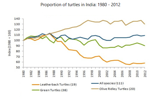 Line graph
The graph below shows the population figures for different types of turtles in India from 1980 to 2012
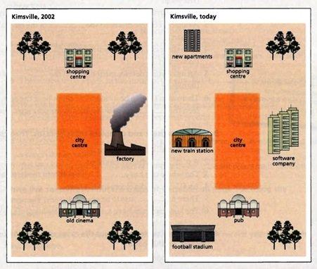 Map
Map
The maps bellow show recent changes in the town of Kimsville
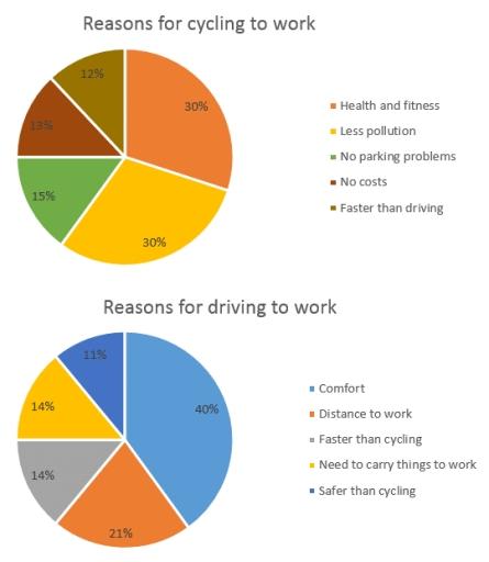 Bar chart
The chart below shows the reasons why people travel to work by bicycle or by car
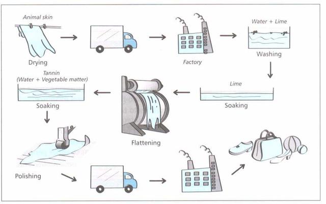 Process diagram
The diagram details the process of making leather products
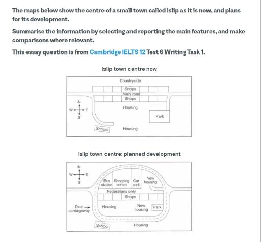 Map
Map
The maps below show the centre of a small town called lslip as it is now, and plans for its development
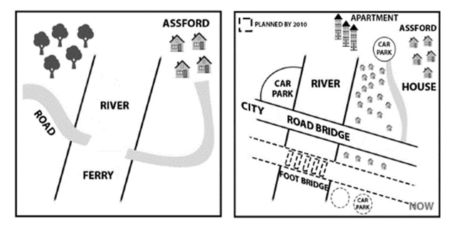 Map
Map
The diagram below shows the development of a particular area between 1965 and the present day
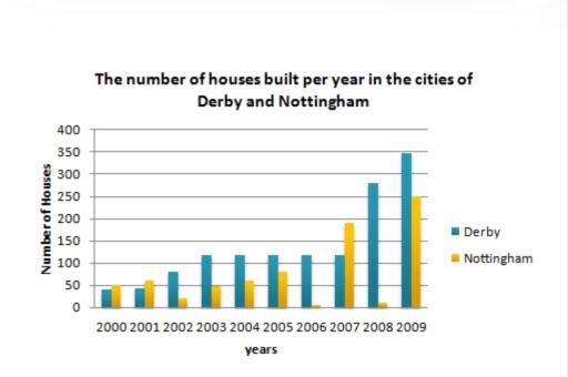 Bar chart
The bar chart below shows the number of houses built per year in two cities, Derby and Nottingham, Between 2000 and 2009. Write a report for a university lecturer describing the information shown below
 Mixed / multiple charts
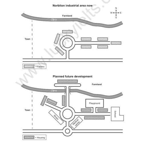
the map below show an industrial area in the town of Norbition and planned future development of the site
 Pie chart
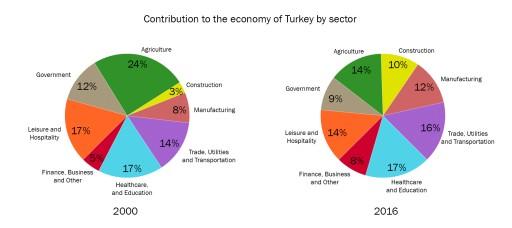
The two pie charts below show the percentages of industry sectors' contribution to the economy of Turkey in 2000 and 2016
 Bar chart
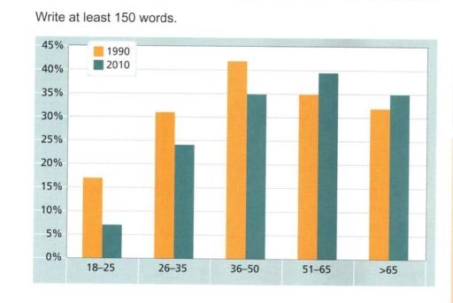
The chart below gives information on the percentage of British people giving money to charity by age range for the years 1990 and 2010
 Bar chart
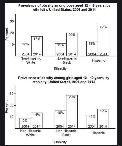
The bar charts below shows the prevalence of obesity among boys and girls aged 12 to 19 by ethnicity, in the United States for the years 2004 and 2014
 Line graph
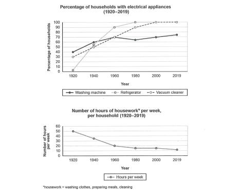
The charts below show the changes in ownership of electrical appliances and amount of time spent doing housework in households in one country between 1920 and 2019
 Table
Table
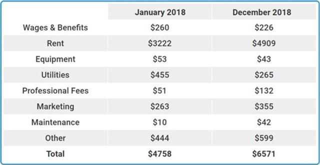
J. The table below shows the expenses of a used bookstore in Scotland for the first and last month of the same year
 Bar chart
The charts below provide information on popular modes of transport in the city of Cambridge for the years 2008 and 2018
 Pie chart
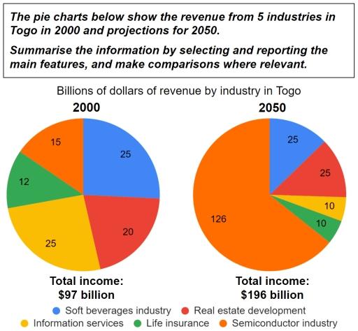
The pie chart below show the rebenue from 5 industries in Togo in 2000 and projections for 2050
 Map
Map
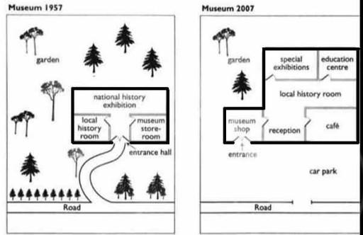
The maps illustrate the changes in the Local Museum at the north-east corner of Hartford Street and Redcliff Street in three separate years: 1957, 1987, 2007
 Bar chart
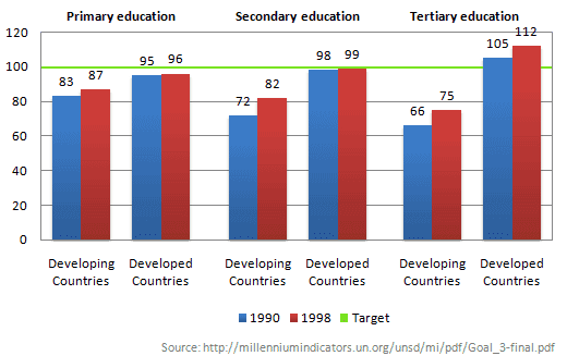
The chart below shows the number of girls per 100 boys enrolled in different levels of school education
 Bar chart
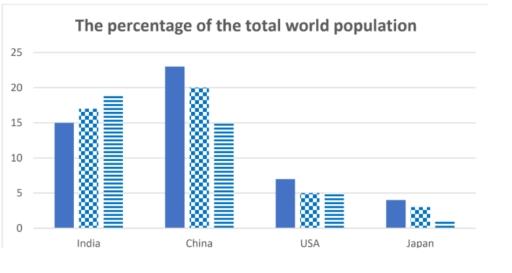
The bar chart shows the percentage of the total world population in 4 countries in 1950 and 2003, and projections for 2050
 Bar chart
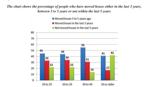
The bar chart shows the percentage of people who have moved house either in last 3 years,between 3years to 5 years,not within the last 5 years
 Process diagram
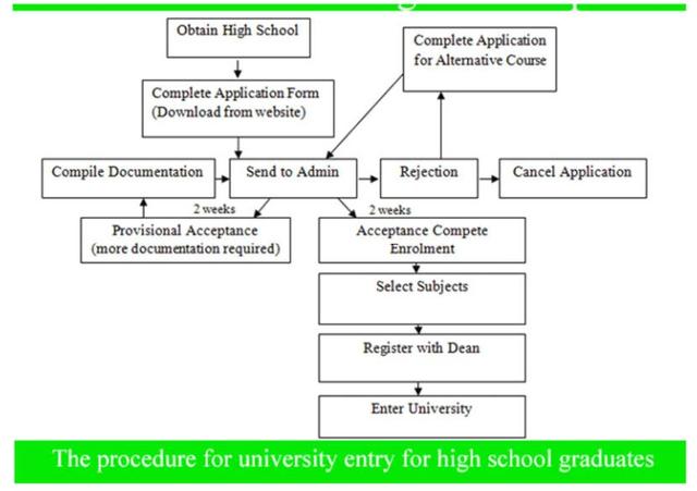
The diagram shows the procedure for university entry for high school graduates. Write a report for a university or college lecturer describing the information