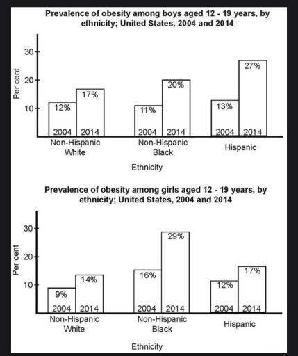
The bar charts below shows the prevalence of obesity among boys and girls aged 12 to 19 by ethnicity, in the United States for the years 2004 and 2014
A full IELTS Academic Writing Task 1 answer to this bar chart at Band 6.0, 7.0, 8.5, with the four-part structure, the comparison language it needs, and why each version scores what it does.
The question
You should spend about 20 minutes on this task.
The bar charts below shows the prevalence of obesity among boys and girls aged 12 to 19 by ethnicity, in the United States for the years 2004 and 2014.
Summarise the information by selecting and reporting the main features, and make comparisons where relevant.
Write at least 150 words.
Prevalence of obesity among American boys and girls aged 12–19 by ethnicity, 2004 and 2014.
What to select from this bar chart
Every one of the six figures rose, so reporting that each increased fills the answer with repetition. The marks are in which group rose most and how the ranking changed: among boys the Hispanic rate more than doubled to become the highest, while among girls the non-Hispanic black rate did the same. Comparing the two sexes against each other, rather than describing the charts in turn, is what lifts this above a list.
Structure
Introduction — Paraphrase: what is measured, in which age group, split how, in which two years.
Overview — No figures: obesity rose in every group, most steeply among Hispanic boys and black girls, and non-Hispanic white teenagers had the lowest rate in both sexes and both years.
Body 1 — Boys — the three ethnicities, with the Hispanic rate overtaking the others.
Body 2 — Girls — the same structure, with the black rate rising highest, and a direct comparison against the boys.
Model answers
Band 6.0 model answer
170 words
The two bar charts show the percentage of obese boys and girls between 12 and 19 years old in the United States in 2004 and 2014, divided into three ethnic groups.
For boys, all three groups increased. Non-Hispanic white boys increased from 12 per cent to 17 per cent. Non-Hispanic black boys increased from 11 per cent to 20 per cent. Hispanic boys increased from 13 per cent to 27 per cent, which was the biggest number for boys in 2014.
For girls, the numbers also increased in all groups. Non-Hispanic white girls increased from 9 per cent to 14 per cent, which was the smallest number in both charts.
Non-Hispanic black girls increased from 16 per cent to 29 per cent, so they had the highest number of all the six groups in 2014. Hispanic girls increased from 12 per cent to 17 per cent.
In conclusion, obesity increased in every group between 2004 and 2014, and the highest percentages in 2014 were Hispanic boys and non-Hispanic black girls.
Why this is Band 6.0
All six pairs of bars are covered with accurate figures, which secures Task Achievement at this level.
Each group's rise is reported separately, so the answer repeats the word 'increased' rather than comparing the size of the increases.
Vocabulary is adequate but repetitive: per cent, increased and obesity recur throughout.
Sentences are mainly simple and compound, with one figure per clause.
Band 7.0 model answer
226 words
The two bar charts compare the prevalence of obesity among American boys and girls aged 12 to 19 across three ethnic groups in 2004 and 2014.
Overall, obesity increased in every group over the decade, but by markedly different amounts. The sharpest rises were among Hispanic boys and non-Hispanic black girls, both of which more than doubled, while non-Hispanic white teenagers recorded the lowest rate in each sex and in both years.
Among boys, the three groups began within two percentage points of one another, at 11 to 13 per cent. They diverged considerably by 2014. Hispanic boys rose most steeply, from 13 to 27 per cent, overtaking both other groups to become the highest. Non-Hispanic black boys nearly doubled from 11 to 20 per cent, whereas non-Hispanic white boys increased more modestly, from 12 to 17 per cent.
The girls' chart shows a similar pattern but with a different group leading. Non-Hispanic black girls were already the highest in 2004 at 16 per cent and rose to 29 per cent, the largest figure in either chart. Hispanic girls climbed from 12 to 17 per cent and non-Hispanic white girls from 9 to 14 per cent — the lowest rate throughout. Comparing the sexes, girls recorded both the highest single figure and the lowest, so the range between groups was wider among girls than among boys.
Why this is Band 7.0
The overview is separate, arrives early and identifies which groups rose most rather than simply noting that all rose.
The size of each increase is compared, so the paragraphs rank rather than list.
Comparison language is accurate: more than doubled, by contrast, overtook, consistently the lowest.
Less common lexis is used accurately: prevalence, ethnicity, margin.
Band 8.5 model answer
257 words
The two bar charts compare the prevalence of obesity among American boys and girls aged 12 to 19, broken down by ethnicity, in 2004 and 2014.
Overall, obesity rose in all six groups across the decade, but the increases were very unevenly distributed. Hispanic boys and non-Hispanic black girls both more than doubled and finished as the highest groups in their respective charts, while non-Hispanic white teenagers had the lowest rate in each sex and in each year without exception.
The boys' figures began closely bunched between 11 and 13 per cent and had separated substantially by 2014. Hispanic boys rose furthest, from 13 to 27 per cent — a gain of fourteen points and slightly more than a doubling — which took them from the middle of the group to a clear lead. Non-Hispanic black boys added nine points to reach 20 per cent, while non-Hispanic white boys rose by only five, from 12 to 17 per cent, the smallest increase in either chart.
Among girls the leading group differed. Non-Hispanic black girls started highest at 16 per cent and climbed to 29 per cent, the largest single figure anywhere on the two charts and an increase of thirteen points. Hispanic and non-Hispanic white girls both rose by five points, to 17 and 14 per cent respectively, so their relative positions were unchanged. Comparing the sexes, the girls' chart contains both the highest figure and the lowest, meaning the spread between ethnic groups was wider among girls in 2014 — fifteen points against ten for boys.
Why this is Band 8.5
The overview names the differential rates of increase and the constant position of one group, which is more informative than reporting that all rose.
Tracks the change in ranking within each sex and compares the two sexes directly, which no single bar shows.
Distinguishes absolute point gains from proportional change, so the size of each rise is measured correctly.
Lexis is precise and economical: prevalence, diverged, consistently, margin, proportionally.
Complex structures are used flexibly, including a fronted concessive, an appositive and a participle clause, with figures embedded naturally.
Model answers written and reviewed by The English All-in-One IELTS team. They are teaching models showing what each band looks like, not real candidate scripts.
This is a bar chart question. The answers above show you what each band looks like when it is finished. What they cannot show you is how to get there from a blank page in forty minutes.
That is what our Writing Study Library is for: the structure we teach for this exact question type, the paragraph pattern that goes with it, and the sentence openers for each stage — so the essay is planned before you start writing rather than assembled as you go.
Everything increased — how do I avoid repeating myself?
Say once in the overview that all groups rose, then spend the body paragraphs on how much and in what order. Ranking the increases and noting which group overtook which turns six identical statements into a set of comparisons.
Should I compare the two charts with each other?
Yes — that is where the least obvious material is. Observing that the girls' chart contains both the highest and lowest figures, and therefore a wider spread, is a comparison neither chart makes on its own.
Do I need to be careful writing about ethnicity?
Use exactly the labels the chart uses and report the figures neutrally. The data is what it is; your job is to describe it accurately. Adding explanations for why one group's rate is higher would be both outside Task 1 and unsupported by anything in front of you.
Is a five-point rise from 9 to 14 the same as one from 12 to 17?
In percentage points, yes — but proportionally the first is larger, since it grew by over half against about two fifths. Mentioning this distinction where it matters is a reliable marker of a higher band.