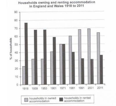
The given bar chart illustrates how many households owned and rented places in England and Wales during the period of 93 years
A full IELTS Academic Writing Task 1 answer to this bar chart at Band 6.0, 7.0, 8.5, with the four-part structure, the comparison language it needs, and why each version scores what it does.
The question
You should spend about 20 minutes on this task.
The given bar chart illustrates how many households owned and rented places in England and Wales during the period of 93 years.
Summarise the information by selecting and reporting the main features, and make comparisons where relevant.
Write at least 150 words.
Percentage of households owning and renting accommodation in England and Wales, 1918–2011.
What to select from this bar chart
The two bars are complements — they must add to 100 per cent — so describing both separately wastes half your words saying the same thing twice. Report the shift once and use the space for the two genuinely reportable events: the crossover around 1971, when the two were level, and the reversal after 2001, when a century-long trend turned round for the first time. That final decline is what most candidates miss.
Structure
Introduction — Paraphrase: what is measured, where, over what span, and note the two categories are proportions of all households.
Overview — No figures: ownership and renting effectively swapped positions over the period, crossing around 1971, and ownership fell back slightly at the very end.
Body 1 — 1918 to 1971 — steady growth in ownership and matching decline in renting, ending level.
Body 2 — 1971 to 2011 — ownership continuing to a peak around 2001, then the reversal in the final decade.
Model answers
Band 6.0 model answer
182 words
The bar chart shows the percentage of households which owned or rented their accommodation in England and Wales between 1918 and 2011.
In 1918, most people rented their home. The percentage of renting households was about 77 per cent, and only about 23 per cent of households owned their accommodation.
After that, the number of owners increased in every year. It was 32 per cent in 1939 and 1953, then 41 per cent in 1961, and in 1971 it reached 50 per cent. In the same year renting also fell to 50 per cent, so the two groups were equal.
After 1971 owning continued to increase. It was 60 per cent in 1981, 68 per cent in 1991 and about 69 per cent in 2001, which was the highest number. Renting decreased to about 32 per cent in the same year.
However, in 2011 the situation changed a little. Owning decreased to 65 per cent and renting increased to 37 per cent.
In conclusion, over this long period owning and renting changed places completely, although at the end owning started to decrease.
Why this is Band 6.0
The main trend is covered with accurate figures at several points, which secures Task Achievement at this level.
Both categories are described separately even though they are complements, so some sentences repeat the same information in reverse.
Vocabulary is adequate but repetitive, with households, increased and decreased doing most of the work.
Sentences are mainly simple and compound, with limited variation in structure.
Band 7.0 model answer
206 words
The bar chart compares the proportion of households in England and Wales living in owned and in rented accommodation at intervals between 1918 and 2011.
Overall, the two categories effectively exchanged positions across the period, with a majority-renting country becoming a majority-owning one. The two were exactly level around 1971, and ownership reached its highest point near the end of the period before falling back in the final decade.
In 1918 renting was overwhelmingly the norm, accounting for approximately 77 per cent of households against only 23 per cent who owned. Ownership then rose consistently, reaching around 32 per cent by 1939 and remaining at that level in 1953, before climbing to about 41 per cent in 1961. By 1971 the two categories had converged, each standing at roughly 50 per cent.
Ownership continued to grow after this point, overtaking renting decisively: it stood at about 60 per cent in 1981, 68 per cent in 1991, and peaked at approximately 69 per cent in 2001, when only around 32 per cent of households were renting. The final decade, however, reversed this long trend for the first time. By 2011 ownership had fallen back to roughly 65 per cent while renting recovered to about 37 per cent.
Why this is Band 7.0
The overview is separate, comes early and identifies both the reversal of the two categories and the late change of direction.
The complementary nature of the data is handled efficiently, so the two bars are reported together rather than twice.
Comparison language is accurate — overtook, the two were level, by contrast, for the first time.
A good range of structures with figures embedded in sentences rather than stacked.
Band 8.5 model answer
260 words
The bar chart compares the proportion of households in England and Wales in owned and rented accommodation at ten points between 1918 and 2011. Since the two categories are complements, each figure implies the other.
Overall, the two forms of tenure exchanged positions almost exactly over the ninety-three years, converting a country in which roughly three quarters of households rented into one in which around two thirds owned. The crossover occurred in 1971, and ownership peaked shortly before the end of the period, falling back in the final decade for the first time in the entire series.
Ownership grew steadily but unevenly through the first half of the period. From approximately 23 per cent in 1918 it climbed to around 32 per cent by 1939, where it plateaued through 1953 before resuming, reaching some 41 per cent in 1961. By 1971 the two lines had converged precisely, each accounting for about half of all households — the single most reportable moment on the chart.
Growth then accelerated: ownership stood at roughly 60 per cent in 1981 and 68 per cent in 1991, before reaching its maximum of approximately 69 per cent in 2001, at which point renting had contracted to around 32 per cent, almost the mirror image of the 1918 position. The final decade broke the pattern. Between 2001 and 2011 ownership retreated by some four points to 65 per cent while renting rose correspondingly to about 37 per cent — a modest movement in itself, but notable as the only reversal in ninety-three years of otherwise uninterrupted trend.
Why this is Band 8.5
The overview selects the two defining events — the exchange of positions and the late reversal — and states them without figures.
Treats the two series as complements and says so, which removes redundancy and frees space for genuine comparison.
Identifies the 2001–2011 turn as the first reversal in nearly a century, an observation available only by reading the whole span rather than individual bars.
Lexis is precise and economical: complement, converged, plateau, reversed, tenure, with consistent hedging.
Structures are varied and controlled, including a fronted adverbial, an appositive and an inverted construction, with no strain.
Model answers written and reviewed by The English All-in-One IELTS team. They are teaching models showing what each band looks like, not real candidate scripts.
This is a bar chart question. The answers above show you what each band looks like when it is finished. What they cannot show you is how to get there from a blank page in forty minutes.
That is what our Writing Study Library is for: the structure we teach for this exact question type, the paragraph pattern that goes with it, and the sentence openers for each stage — so the essay is planned before you start writing rather than assembled as you go.
The two bars always add to 100 — do I describe both?
Say once that they are complements, then report the movement of one and let the other follow. Describing both fully means writing every fact twice in reverse, which wastes half your words and adds nothing the examiner can credit.
Is a small change at the end worth mentioning?
Here it is one of the most important things on the chart, because it is the only reversal in the whole series. Significance depends on context, not size — four percentage points matters far more when it breaks a ninety-year pattern than when it is one fluctuation among many.
How do I handle a chart covering a very long period?
Split it at a meaningful point rather than by decade. The 1971 crossover divides this chart naturally into a before and an after, which gives each body paragraph a clear job and lets you describe direction rather than reciting every bar.
Should I say why ownership rose?
No. Task 1 asks you to report what the data shows, and explanations of housing policy or the economy are outside it. Speculating about causes takes words from the reporting you are actually marked on.