
Bar chart Task 1 Academic

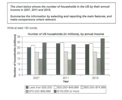
The chart below shows the number of households in the US by their annual income in 2007, 2011 and 2015

A full IELTS Academic Writing Task 1 answer to this bar chart at Band 6.0, 7.0, 8.5, with the four-part structure, the comparison language it needs, and why each version scores what it does.

The question

You should spend about 20 minutes on this task.

The chart below shows the number of households in the US by their annual income in 2007, 2011 and 2015.

Summarise the information by selecting and reporting the main features, and make comparisons where relevant.

Write at least 150 words.

Bar chart of the number of US households in millions by annual income in 2007, 2011 and 2015. Households earning $100,000 or more rise from about 29.5 to 33 million, the top group becoming clearly the largest by 2015, while the $25,000 to $49,999 group falls from about 27 to 28.5 and the $50,000 to $74,999 group stays near 21 million throughout.
Number of US households in millions by annual income, 2007, 2011 and 2015.

What to select from this bar chart

Five income bands across three years is fifteen figures, so grouping is essential. The reportable pattern is at the two ends: the highest-earning group grew steadily and pulled clearly ahead by 2015, while the middle bands barely moved. Note that this chart counts households in millions rather than percentages, so you can talk about numbers growing without any of the caveats a share-based chart would require.

Structure

Introduction — Paraphrase: what is counted, where, in which three years, and in what units.

Overview — No figures: the highest income group grew throughout and became the largest by a clear margin, while the middle bands were broadly flat.

Body 1 — The top band and the lowest band — the two that moved most.

Body 2 — The three middle bands, grouped together because they changed comparatively little.

Model answers

Band 6.0 model answer

180 words

The bar chart shows the number of households in the United States in five income groups in 2007, 2011 and 2015. The numbers are in millions.

In 2007, the group with $25,000 to $49,999 was the biggest with about 27 million households. The group with $100,000 or more was very close with about 29.5 million. The smallest group was $75,000 to $99,999 with only about 14.5 million.

In 2011 the numbers were similar. The group with $100,000 or more was about 27.5 million and the group with less than $25,000 increased to about 29 million.

In 2015 the group with $100,000 or more increased a lot and reached about 33 million, so it became the biggest group. The group with less than $25,000 was about 28 million and the group with $25,000 to $49,999 was about 28.5 million.

The two middle groups did not change very much. The group $50,000 to $74,999 stayed at about 21 million in all three years.

In conclusion, the number of rich households increased in this period, and the middle groups did not change much.

Why this is Band 6.0

  • All five bands are covered across the three years with accurate figures, which secures Task Achievement at this level.
  • The chart is described year by year rather than grouped by trend, so the pattern has to be inferred.
  • Vocabulary is adequate but repetitive: households, million and increased recur throughout.
  • Sentences are mainly simple and compound, with figures presented one per clause.

Band 7.0 model answer

204 words

The bar chart compares the number of households in the United States, measured in millions, across five annual income bands in 2007, 2011 and 2015.

Overall, the highest income group expanded steadily across the period and had become the largest band by a clear margin by 2015, whereas the middle bands changed comparatively little. The lowest band also grew, though less consistently.

The most substantial change occurred at the top of the scale. Households earning $100,000 or more numbered approximately 29.5 million in 2007, dipped to around 27.5 million in 2011, and then rose sharply to about 33 million by 2015 — the highest figure anywhere on the chart and some 4.5 million above any other band in that year. Households earning under $25,000 also increased, from roughly 25 million in 2007 to about 29 million in 2011, before easing slightly to 28 million.

The three middle bands were far more stable. Those earning $25,000 to $49,999 remained between approximately 27 and 30 million throughout, while the $50,000 to $74,999 band held almost constant at around 21 million in all three years. The $75,000 to $99,999 group was consistently the smallest, moving only from about 14.5 million to 15.5 million across the eight years.

Why this is Band 7.0

  • The overview is separate, arrives early and identifies the growth of the top band as the main development.
  • The bands are grouped by how much they changed rather than described year by year.
  • Comparison language is used accurately: by contrast, broadly flat, overtook, the widest margin.
  • Figures are integrated into sentences and the stability of the middle bands is treated as a finding, not an omission.

Band 8.5 model answer

245 words

The bar chart compares the number of American households, in millions, falling into five annual income bands in 2007, 2011 and 2015.

Overall, almost all of the movement occurred at the extremes of the income scale. The highest-earning band grew markedly and pulled clearly ahead of every other group by 2015, while the three middle bands were broadly static throughout. Because the chart counts households rather than shares, this represents genuine growth in the number of high-earning households rather than a redistribution.

The top band did not rise smoothly. Households earning $100,000 or more stood at roughly 29.5 million in 2007 and actually fell to around 27.5 million in 2011, before climbing steeply to approximately 33 million in 2015 — an increase of some 5.5 million in four years, and enough to leave it about 4.5 million clear of the next largest group. The lowest band followed a different shape again, rising from about 25 million to 29 million between 2007 and 2011 and then easing back marginally to around 28 million.

By contrast, the middle of the distribution barely moved. The $25,000 to $49,999 band fluctuated only within a narrow range of roughly 27 to 30 million, and the $50,000 to $74,999 band was remarkably stable at close to 21 million in every year, varying by well under one million. Households earning $75,000 to $99,999 remained consistently the smallest group throughout, edging up only from about 14.5 to 15.5 million across the whole period.

Why this is Band 8.5

  • The overview captures both the movement at the top and the stability in the middle, which together describe the chart more accurately than either alone.
  • Groups the five bands into two categories justified by behaviour, so every sentence does comparative work.
  • Notes that the chart counts households rather than shares, which licenses claims about growth that a percentage chart would not support.
  • Lexis is precise and economical: band, broadly static, pulled ahead, margin, consistently the smallest.
  • Complex structures are used flexibly, with a fronted adverbial, an appositive and a participle clause, and figures embedded naturally.

Model answers written and reviewed by The English All-in-One IELTS team. They are teaching models showing what each band looks like, not real candidate scripts.

This is a bar chart question. The answers above show you what each band looks like when it is finished. What they cannot show you is how to get there from a blank page in forty minutes.

That is what our Writing Study Library is for: the structure we teach for this exact question type, the paragraph pattern that goes with it, and the sentence openers for each stage — so the essay is planned before you start writing rather than assembled as you go.

See the structure for this question type →

Vocabulary for this topic

Word or phraseMeaningUsed in a sentence
income banda range of earnings grouped togetherThe highest income band grew fastest.
broadly staticbarely changing over the periodThe middle bands were broadly static.
to pull aheadto move clearly in front of the othersThe top band pulled ahead by 2015.
marginthe size of the gap between two figuresIt finished 4.5 million clear of the next group.
to ease backto fall slightly after risingThe lowest band eased back to 28 million.
distributionhow a total is spread across categoriesThe middle of the distribution barely moved.
to fluctuate within a narrow rangeto move up and down only slightlyThis band fluctuated within a narrow range.
redistributiona shift of share from one group to anotherThis is genuine growth rather than redistribution.

Write your own answer

Draft your response below, then get it marked against all four IELTS criteria. Your draft stays in this browser — nothing is published.

Common questions

Is 'nothing changed' worth writing about?

Yes — stability is a main feature, not an absence of one. Noting that the $50,000 to $74,999 band sat at around 21 million in all three years is a genuine finding, and an overview that reports only what moved gives an incomplete picture of the chart.

Does this chart show that Americans got richer?

It shows more households in the top band, which is not quite the same claim and is as far as you should go. The chart counts households, not people or incomes, and says nothing about why the numbers moved. Reporting what is there and stopping is what Task Achievement rewards.

Why does it matter that the units are millions rather than percentages?

Because with counts, one band growing does not require another to shrink. On a percentage chart every rise is funded by a fall; here all five bands could in principle grow at once. Getting this distinction right prevents a common accuracy error.

Should I describe each year in turn?

No — group the bands by behaviour instead. Working through 2007, then 2011, then 2015 produces three lists and no comparison, whereas grouping by which bands moved and which did not lets you compare in almost every sentence.