
Bar chart Task 1 Academic

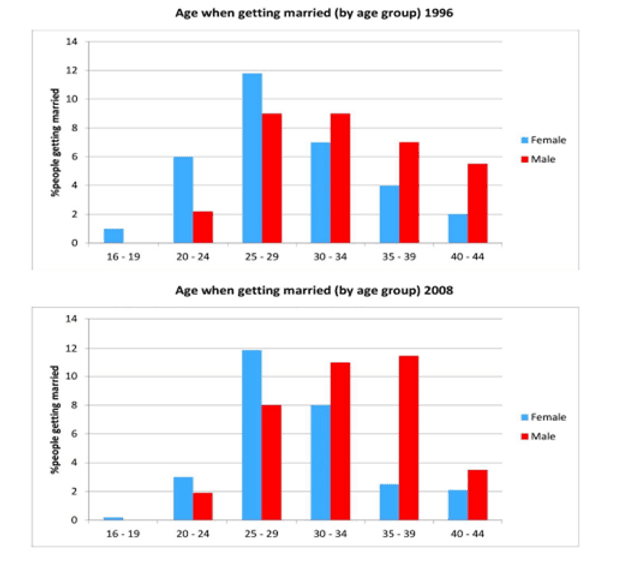
The charts below give information on the ages of people when they got married in one particular country in 1996 and 2008

A full IELTS Academic Writing Task 1 answer to this bar chart at Band 6.0, 7.0, 8.5, with the four-part structure, the comparison language it needs, and why each version scores what it does.

The question

You should spend about 20 minutes on this task.

The charts below give information on the ages of people when they got married in one particular country in 1996 and 2008.

Summarise the information by selecting and reporting the main features, and make comparisons where relevant.

Write at least 150 words.

Two bar charts showing the percentage of people getting married by age group in 1996 and 2008, split by sex. In 1996 women peak at 25 to 29 at about 12 per cent and men at 25 to 29 and 30 to 34 at about 9 per cent. In 2008 women still peak at 25 to 29 while men peak at 35 to 39 at about 11.5 per cent.
Percentage of people getting married by age group and sex, in one country, in 1996 and 2008.

What to select from this bar chart

Two charts, two sexes and six age bands is a lot of numbers, so selection matters more here than in almost any other Task 1 type. The reportable story is that women's behaviour barely changed while men's shifted substantially later — and that men overtook women in every band above thirty by 2008. Comparing the two charts rather than describing them one after the other is what separates the bands.

Structure

Introduction — Paraphrase: what is measured, in which country, split how, in which two years.

Overview — No figures: the peak age for women stayed the same while men married noticeably later, and marriage below twenty-five fell for both.

Body 1 — Women across both years — the unchanged peak at 25–29, and the fall in the youngest bands.

Body 2 — Men across both years — the peak moving from 25–34 to 35–39, and the reversal against women in the older bands.

Model answers

Band 6.0 model answer

195 words

The two bar charts show the percentage of men and women who got married at different ages in one country in 1996 and in 2008.

In 1996, the most popular age for women was 25 to 29, with about 12 per cent. After that came the group 30 to 34 with 7 per cent and the group 20 to 24 with 6 per cent. For men, the highest figures were in the groups 25 to 29 and 30 to 34, both about 9 per cent.

In 2008, women again had their highest number in the group 25 to 29, again about 12 per cent. But the group 20 to 24 decreased to only 3 per cent, and the group 35 to 39 also decreased to about 2.5 per cent.

For men in 2008 the situation changed more. The group 35 to 39 became the highest with about 11.5 per cent, and the group 30 to 34 was also high with 11 per cent. The group 25 to 29 decreased from 9 to 8 per cent.

In conclusion, women married at the same age in both years, but men married later in 2008 than in 1996.

Why this is Band 6.0

  • Both years and both sexes are covered with accurate figures, which satisfies the basic requirement of Task Achievement.
  • The charts are described one after the other rather than compared, so the main development has to be inferred by the reader.
  • Vocabulary is adequate but repetitive, with percentage, people and got married recurring throughout.
  • Sentence structures are largely simple and compound, with limited variation in how figures are introduced.

Band 7.0 model answer

236 words

The two bar charts compare the percentage of men and women in one country who married at different ages in 1996 and 2008.

Overall, the pattern for women was remarkably stable across the twelve years, whereas men married considerably later in 2008 than they had in 1996. Marriage in the youngest age bands became less common for both sexes.

For women, the most common age at marriage was 25 to 29 in both years, at approximately 12 per cent, so the peak did not shift at all. What changed was the distribution around it. Marriages among women aged 20 to 24 halved, falling from about 6 per cent to 3 per cent, and the 35 to 39 band declined from 4 per cent to roughly 2.5 per cent. The only band to grow was 30 to 34, which rose modestly from 7 to 8 per cent.

The male pattern moved much more decisively. In 1996 men were most likely to marry between 25 and 34, with both of those bands standing at around 9 per cent. By 2008 the peak had moved up to the 35 to 39 group at approximately 11.5 per cent, closely followed by 30 to 34 at 11 per cent, while the 25 to 29 figure fell to 8 per cent. As a result, men outnumbered women in every age band above thirty by 2008, having been level or behind in 1996.

Why this is Band 7.0

  • The overview is separate, comes early and contains no figures, and it names the contrast between the sexes as the main feature.
  • Each body paragraph tracks one sex across both years, which forces comparison rather than description.
  • Comparison language is handled properly: whereas, by contrast, remained unchanged, overtook.
  • A good range of structures, with figures embedded into sentences rather than listed one per clause.

Band 8.5 model answer

263 words

The two bar charts compare the proportion of men and women marrying within six age bands in one country, in 1996 and in 2008.

Overall, the female distribution changed very little between the two years, while the male distribution shifted markedly upwards. The consequence was that by 2008 men were more likely than women to marry at every age above thirty, reversing the position twelve years earlier.

Women's behaviour was notably stable. The 25 to 29 band was the most common in both years at roughly 12 per cent, so the peak itself did not move at all; the changes occurred on either side of it. Marriage between 20 and 24 halved, from about 6 to 3 per cent, and the 35 to 39 group fell from 4 to approximately 2.5 per cent, while 30 to 34 edged up from 7 to 8 per cent. Marriages under twenty, already negligible at about 1 per cent, had all but disappeared by 2008.

The male pattern, by contrast, moved decisively later. In 1996 men married most commonly between 25 and 34, with those two bands level at around 9 per cent. Twelve years on, the peak had relocated to 35 to 39 at some 11.5 per cent, with 30 to 34 close behind at 11 per cent, while the 25 to 29 figure slipped to 8 per cent. Taken together with the female data, this means that a woman in 2008 was still most likely to marry in her late twenties, whereas a man had become most likely to do so a full decade later.

Why this is Band 8.5

  • The overview identifies the asymmetry between the sexes as the defining feature, which is the single most reportable thing on these charts.
  • Both paragraphs compare across years rather than describing charts in sequence, and the final sentence draws the two threads together into a genuine comparison.
  • Selection is disciplined: the near-empty 16–19 band is dismissed in a clause rather than given a sentence of its own.
  • Lexis is precise and economical — stable, shifted upwards, outnumbered, negligible, markedly — with consistent approximation language.
  • Complex structures are used flexibly: a fronted concessive, an appositive and a participle clause, with no sense of strain.

Model answers written and reviewed by The English All-in-One IELTS team. They are teaching models showing what each band looks like, not real candidate scripts.

This is a bar chart question. The answers above show you what each band looks like when it is finished. What they cannot show you is how to get there from a blank page in forty minutes.

That is what our Writing Study Library is for: the structure we teach for this exact question type, the paragraph pattern that goes with it, and the sentence openers for each stage — so the essay is planned before you start writing rather than assembled as you go.

See the structure for this question type →

Vocabulary for this topic

Word or phraseMeaningUsed in a sentence
age banda range of ages grouped together in a chartThe 25 to 29 age band was the most common in both years.
to shift upwardsto move towards higher values or older agesThe male distribution shifted markedly upwards.
to halveto fall to half the previous figureMarriage between 20 and 24 halved for women.
negligibleso small it barely mattersMarriages under twenty were negligible in both years.
to outnumberto be greater in number than another groupMen outnumbered women in every band above thirty by 2008.
distributionhow the total is spread across the categoriesThe female distribution barely changed.
to relocate (of a peak)to move to a different categoryThe male peak relocated to the 35 to 39 band.
stablenot changing much over timeWomen's behaviour was notably stable.

Write your own answer

Draft your response below, then get it marked against all four IELTS criteria. Your draft stays in this browser — nothing is published.

Common questions

How do I organise two charts with two groups in each?

Give one body paragraph to each group and track it across both charts. Describing chart one and then chart two forces the reader to do the comparison themselves, and comparison is explicitly what the task asks for.

Do I have to mention every age band?

No. Coverage means the main features, not every number. Here the 16 to 19 band is close to zero in both years and deserves a clause at most; spending a sentence on it while neglecting the shift in the male peak would be poor selection.

Can I mention what the charts do NOT show?

Briefly, if it prevents a wrong claim — for example noting that these are percentages within each sex rather than absolute numbers of marriages. Do not speculate about causes, though; explaining <em>why</em> people married later is outside Task 1 and earns nothing.

How exact should the figures be?

Approximate and clearly hedged. Use <em>roughly</em>, <em>approximately</em>, <em>just under</em>, <em>some</em>. Reading a bar to the exact decimal is neither possible nor rewarded, and confident approximation demonstrates control of the data.