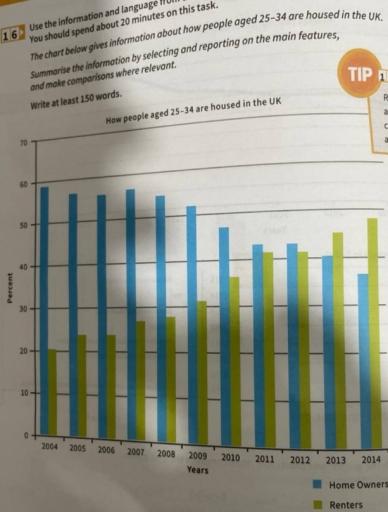
The chart below gives information about how people aged 25 - 34 are housed in the UK
A full IELTS Academic Writing Task 1 answer to this bar chart at Band 6.0, 7.0, 8.5, with the four-part structure, the comparison language it needs, and why each version scores what it does.
The question
You should spend about 20 minutes on this task.
The chart below gives information about how people aged 25 - 34 are housed in the UK.
Summarise the information by selecting and reporting the main features, and make comparisons where relevant.
Write at least 150 words.
Percentage of people aged 25–34 in the UK who owned or rented their home, 2004–2014.
What to select from this bar chart
Two series moving steadily in opposite directions, so the crossover is the event the overview must name. One thing to be careful about: these two categories do not add to 100 in the early years, which means some of this age group were housed some other way — living with parents, for instance — so you cannot treat one figure as implying the other. Say the trend, not the arithmetic.
Structure
Introduction — Paraphrase: which age group, which country, what is measured, over what period.
Overview — No figures: ownership declined throughout while renting rose, and the two changed places towards the end of the period.
Body 1 — Home ownership — gradual at first, then accelerating after 2008, with figures at each end.
Body 2 — Renting — the mirror rise, the crossover point, and the position at the end.
Model answers
Band 6.0 model answer
186 words
The bar chart shows the percentage of people between 25 and 34 years old in the UK who owned a home or rented a home from 2004 to 2014.
In 2004, most young people in this age group owned their home. The percentage of home owners was about 59 per cent and the percentage of renters was only about 20 per cent.
Between 2004 and 2008 the percentage of owners did not change very much and stayed around 57 or 58 per cent. The percentage of renters increased slowly to about 28 per cent.
After 2008 the situation changed faster. Home ownership decreased to 49 per cent in 2010 and 45 per cent in 2011. In the same years renting increased to 37 per cent and then 42 per cent.
Around 2012 the two groups became almost equal, and after that renting became bigger. In 2014 only about 38 per cent of this age group owned a home, but about 51 per cent rented one.
In conclusion, over these eleven years young people in the UK changed from mostly owning their home to mostly renting it.
Why this is Band 6.0
The overall trend is covered with accurate figures at several points, which secures Task Achievement at this level.
The two series are described one after the other, so the crossover is mentioned but not treated as the key event.
Vocabulary is adequate but repetitive: percentage, increased and decreased carry most of the meaning.
Sentences are largely simple and compound with limited variation.
Band 7.0 model answer
204 words
The bar chart compares the proportion of people aged 25 to 34 in the UK who owned their home with the proportion who rented, in each year from 2004 to 2014.
Overall, home ownership among this age group declined substantially over the period while renting rose by a similar amount, and the two categories exchanged positions towards the end. The change was gradual at first and accelerated markedly after 2008.
Home ownership began at approximately 59 per cent in 2004 and held broadly steady for the next four years, still standing at around 57 per cent in 2008. From that point it fell consistently: to about 49 per cent by 2010, 45 per cent in 2011, and eventually to roughly 38 per cent in 2014, a total decline of some twenty percentage points.
Renting followed the opposite path from a much lower base. It rose from around 20 per cent in 2004 to approximately 28 per cent by 2008, then climbed more steeply, reaching about 37 per cent in 2010 and 42 per cent in 2011. The two categories converged around 2012 and renting overtook ownership thereafter, finishing at roughly 51 per cent — almost exactly the reverse of the position eleven years earlier.
Why this is Band 7.0
The overview is separate, arrives early and names the reversal of the two categories as the main feature.
The change of pace after 2008 is identified, which is a genuine feature of the data rather than a uniform description.
Comparison language is used accurately: overtook, converged, by contrast, the reverse position.
Figures are integrated into sentences and the two series are related to each other rather than reported separately.
Band 8.5 model answer
266 words
The bar chart compares the percentage of UK residents aged 25 to 34 who owned their accommodation with the percentage who rented, annually between 2004 and 2014.
Overall, the two forms of tenure moved in opposite directions and effectively swapped places over the eleven years. The movement was slow for the first four years and then accelerated sharply, with the crossover occurring around 2012. It is worth noting that the two figures do not sum to 100 in the earlier years, so a proportion of this age group was housed in some other way.
Ownership opened at approximately 59 per cent and was remarkably stable to 2008, fluctuating only between about 57 and 58 per cent across those years. Thereafter it fell without interruption — to roughly 54 per cent in 2009, 49 per cent in 2010, and 45 per cent in 2011 — before easing more gently to around 38 per cent by 2014. The cumulative loss of some twenty percentage points therefore occurred almost entirely in the second half of the period.
Renting traced the mirror image from a much lower starting point of about 20 per cent, edging up to roughly 28 per cent by 2008 and then climbing steeply to approximately 37 per cent in 2010 and 42 per cent in 2011. The two categories drew level at around 45 per cent in 2012, after which renting moved ahead decisively, reaching some 51 per cent in 2014. By the end of the period a clear majority of this age group were renting, having been a small minority on the eve of 2008.
Why this is Band 8.5
The overview selects both the reversal and the change of pace, which together describe the chart more accurately than either alone.
Notes that the two categories do not sum to 100, preventing the common error of treating them as complements.
Locates the acceleration and the crossover precisely, and quantifies the total movement rather than only the endpoints.
Lexis is precise and economical: tenure, converged, accelerated, mirror, on the eve of.
Structures are varied and controlled, with a fronted adverbial, an appositive and a participle clause, and no strain.
Model answers written and reviewed by The English All-in-One IELTS team. They are teaching models showing what each band looks like, not real candidate scripts.
This is a bar chart question. The answers above show you what each band looks like when it is finished. What they cannot show you is how to get there from a blank page in forty minutes.
That is what our Writing Study Library is for: the structure we teach for this exact question type, the paragraph pattern that goes with it, and the sentence openers for each stage — so the essay is planned before you start writing rather than assembled as you go.
Can I assume two categories add up to 100 per cent?
Only if the chart tells you so. Here ownership and renting come to well under 100 in the early years, so some of this age group must be housed another way. Assuming complementarity and writing "the rest rented" would be a factual error the examiner can see on the page.
Should I describe every year?
No. Group the years by behaviour — stable to 2008, then falling steeply — and give figures at the start, the turning point and the end. Listing eleven pairs of numbers is the classic way to write 200 words and still score 6 for Task Achievement.
How do I describe a change of pace?
Name it and locate it: "held broadly steady until 2008, then fell consistently". Identifying where a trend changes speed is a genuine main feature and is exactly the kind of selection the higher bands reward.
Is the crossover always worth mentioning?
When two series exchange positions, yes — it is usually the single most reportable moment on the chart and belongs in the overview. Give the approximate year and the approximate level at which it happened.