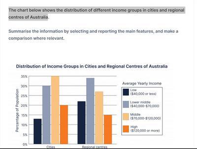
The bar chart depicts the distribution of income groups, namely low (40,000 dollars or less), lower middle (40,00 - 70,000 dollars), middle (70,000 - 120,00 dollars), and high (120,000 dollars or more) in the cities and the regional centers of Australia
A full IELTS Academic Writing Task 1 answer to this bar chart at Band 6.0, 7.0, 8.5, with the four-part structure, the comparison language it needs, and why each version scores what it does.
The question
You should spend about 20 minutes on this task.
The bar chart depicts the distribution of income groups, namely low (40,000 dollars or less), lower middle (40,00 - 70,000 dollars), middle (70,000 - 120,00 dollars), and high (120,000 dollars or more) in the cities and the regional centers of Australia.
Summarise the information by selecting and reporting the main features, and make comparisons where relevant.
Write at least 150 words.
Distribution of income groups in cities and regional centres of Australia, as a percentage of population.
What to select from this bar chart
Only two locations and four bands, so the data is small and the marks come entirely from comparing rather than listing. The reportable pattern is that the middle band is almost identical in both places while everything around it shifts: cities are weighted towards the top of the scale and regional centres towards the bottom. Note that these are percentages of each area's own population, so nothing here says which area has more people.
Structure
Introduction — Paraphrase: what is compared, where, and that figures are percentages of each area's population.
Overview — No figures: the middle income group is the largest in both locations, but cities have proportionally more high earners and regional centres proportionally more low earners.
Body 1 — Cities — the distribution weighted towards the upper bands.
Body 2 — Regional centres — the same middle peak but with the balance shifted downwards, compared directly against the city figures.
Model answers
Band 6.0 model answer
161 words
The bar chart shows the percentage of people in four different income groups in cities and in regional centres of Australia.
In cities, the biggest group was the middle income group with about 35 per cent. The second was the lower middle group with 30 per cent, and the high income group was about 20 per cent. The low income group was the smallest with only 13 per cent.
In regional centres the situation was different. The middle income group was again the biggest with about 34 per cent, but the lower middle group was 27 per cent and the low income group was about 22 per cent, which is much more than in cities.
The high income group in regional centres was only about 15 per cent, so it was smaller than in cities.
In conclusion, the middle group was the biggest in both places, but there were more rich people in cities and more poor people in regional centres.
Why this is Band 6.0
All four income groups are covered for both locations with accurate figures, which secures Task Achievement at this level.
The two locations are described one after the other, so comparison is left to the reader.
Vocabulary is adequate but repetitive, with percentage, group and people recurring.
Sentences are largely simple and compound with figures presented one per clause.
Band 7.0 model answer
218 words
The bar chart compares how four income groups are distributed between cities and regional centres in Australia, expressed as a percentage of the population in each type of location.
Overall, the middle income band was the largest group in both cities and regional centres, at almost the same level. The difference lies on either side of it: cities contained proportionally more high earners, while regional centres contained noticeably more people on low incomes.
In cities, the distribution was weighted towards the upper end of the scale. The middle band, earning between $70,000 and $120,000, was the largest at approximately 35 per cent, followed by the lower middle band at around 30 per cent. High earners on $120,000 or more accounted for roughly 20 per cent, while those on $40,000 or less made up only about 13 per cent — the smallest group in either location.
Regional centres showed the reverse balance. The middle band remained dominant at around 34 per cent, virtually identical to the city figure, but below it the lower middle group fell to approximately 27 per cent and the low income group rose sharply to about 22 per cent, some nine points higher than in cities. Correspondingly, high earners represented only around 15 per cent of the regional population, five points below the urban equivalent.
Why this is Band 7.0
The overview is separate, arrives early and identifies the shared middle peak alongside the opposite weighting of the two locations.
The two areas are compared band by band rather than described in sequence.
Comparison language is used accurately: whereas, by contrast, the reverse, correspondingly.
Figures are integrated into sentences, and the relationship between bands is described rather than merely reported.
Band 8.5 model answer
255 words
The bar chart compares the distribution of four income groups across Australian cities and regional centres, with each figure expressed as a share of that location's own population.
Overall, the middle income band was the largest group in both locations and at almost exactly the same level, so the difference between city and country lies entirely in how the remaining population is arranged around it. Cities are skewed towards the upper bands and regional centres towards the lower ones.
The two middle categories tell most of the story. Earners on $70,000 to $120,000 accounted for approximately 35 per cent of city dwellers and around 34 per cent of those in regional centres — a difference small enough to be treated as none. The lower middle band, however, diverges: roughly 30 per cent in cities against about 27 per cent regionally, the first sign of the downward shift.
The extremes make the contrast unmistakable. High earners on $120,000 or more represented some 20 per cent of the urban population but only around 15 per cent of the regional one, while the pattern reverses at the bottom of the scale, where those on $40,000 or less made up about 22 per cent of regional centres against just 13 per cent of cities — the single largest gap on the chart at roughly nine percentage points. It is worth noting that these are proportions rather than counts, so the chart shows that regional populations are weighted towards lower incomes, not that more low-income Australians live outside the cities.
Why this is Band 8.5
The overview selects the two features that matter — an identical middle band and opposite weighting on either side — without descending into figures.
Compares band by band rather than location by location, so every sentence in the second paragraph does comparative work.
Notes explicitly that these are proportions within each area, preventing the common misreading that cities contain more high earners in absolute terms.
Lexis is precise and economical: weighted towards, the reverse, correspondingly, skewed, marginally.
Structures are varied and controlled, with a fronted concessive, an appositive and a participle clause, and figures embedded naturally.
Model answers written and reviewed by The English All-in-One IELTS team. They are teaching models showing what each band looks like, not real candidate scripts.
This is a bar chart question. The answers above show you what each band looks like when it is finished. What they cannot show you is how to get there from a blank page in forty minutes.
That is what our Writing Study Library is for: the structure we teach for this exact question type, the paragraph pattern that goes with it, and the sentence openers for each stage — so the essay is planned before you start writing rather than assembled as you go.
Not unless the totals are the same, and here they are not given. Cities almost certainly hold far more people than regional centres, so a smaller share of city dwellers on low incomes could still be a larger number. Write about proportions and the claim stays accurate.
There are only two groups — is there enough to write about?
Yes, because with fewer figures the marks shift entirely onto comparison. Compare band by band rather than describing one location and then the other, and note where the two are similar as well as where they differ.
Should I say the middle bands are 'the same'?
Say they are virtually identical or that the difference is negligible, and give both figures. Claiming they are exactly equal when one reads 35 and the other 34 would be inaccurate, but treating a one-point gap as a real difference would be poor selection.
Do I need to repeat the income ranges from the legend?
Mention them once, briefly, when you first name a band. Repeating the full dollar range every time wastes words, and after the first mention "the middle band" is perfectly clear.