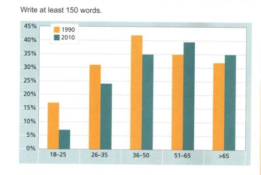
The chart below gives information on the percentage of British people giving money to charity by age range for the years 1990 and 2010
A full IELTS Academic Writing Task 1 answer to this bar chart at Band 6.0, 7.0, 8.5, with the four-part structure, the comparison language it needs, and why each version scores what it does.
The question
You should spend about 20 minutes on this task.
The chart below gives information on the percentage of British people giving money to charity by age range for the years 1990 and 2010.
Summarise the information by selecting and reporting the main features, and make comparisons where relevant.
Write at least 150 words.
Percentage of British people donating to charity by age range, 1990 and 2010.
What to select from this bar chart
Five age bands and two years, and the reportable feature is not any individual bar but the direction: the three younger groups all fell and the two older groups both rose. That means the age at which giving peaks moved upwards, which is the single sentence the overview needs. Notice also that the largest change in percentage points is not the largest change proportionally — 18 to 25 lost ten points but that was well over half of its original figure.
Structure
Introduction — Paraphrase: what is measured, where, split how, in which two years.
Overview — No figures: giving declined among younger people and rose among older ones, so the peak moved from the 36–50 band to the 51–65 band.
Body 1 — The three groups that fell, with the steepest first, and the proportional point about 18–25.
Body 2 — The two groups that rose, and the resulting change in which band gave most.
Model answers
Band 6.0 model answer
160 words
The bar chart shows how many British people gave money to charity in 1990 and in 2010. The people are divided into five age groups and the numbers are in percentages.
In the group 18 to 25, the percentage decreased a lot, from about 17 per cent in 1990 to only 7 per cent in 2010. The group 26 to 35 also decreased, from 31 per cent to 24 per cent.
The group 36 to 50 was the highest in 1990 with about 42 per cent, but in 2010 it decreased to 35 per cent.
The two older groups did the opposite. The group 51 to 65 increased from 35 per cent to about 39 per cent, and the group over 65 increased from 31 per cent to about 35 per cent.
In conclusion, young people gave less money in 2010 than in 1990, but older people gave more, and in 2010 the group 51 to 65 was the highest.
Why this is Band 6.0
All five age bands are covered with accurate figures, which secures the basis of Task Achievement.
The bands are listed in order rather than grouped by direction, so the reader has to work out the pattern.
Vocabulary is adequate but repetitive: percentage, people and decreased do most of the work.
Sentences are mainly simple and compound, and several begin the same way.
Band 7.0 model answer
208 words
The bar chart compares the proportion of British people in five age groups who donated to charity in 1990 and in 2010.
Overall, charitable giving fell among people under fifty and rose among those over fifty, with the result that the most generous age group changed between the two years. The steepest decline by far occurred among the youngest respondents.
The three younger bands all recorded lower figures in 2010. The fall was sharpest among those aged 18 to 25, dropping from approximately 17 per cent to just 7 per cent — a loss of ten percentage points, which represents well over half of the original figure. Donations among 26 to 35 year olds declined from about 31 to 24 per cent, and the 36 to 50 group, which had been the most likely to give in 1990 at roughly 42 per cent, fell to around 35 per cent.
The reverse was true of the two oldest groups. Giving among 51 to 65 year olds rose from approximately 35 to 39 per cent, and among those over 65 it increased from 31 to around 35 per cent. As a consequence, the 51 to 65 band had become the most charitable group by 2010, having ranked second in 1990.
Why this is Band 7.0
The overview is separate, arrives early and contains no figures, and it identifies the shift in the peak as the main feature.
Bands are grouped by direction of change rather than listed in order, which turns description into comparison.
Comparison language is used properly — whereas, by contrast, the reverse was true — and proportional change is distinguished from absolute change.
A range of structures with figures integrated into sentences rather than stacked one per clause.
Band 8.5 model answer
246 words
The bar chart compares the percentage of British people donating to charity across five age bands in 1990 and 2010.
Overall, the two years divide cleanly by age: every group below fifty gave less in 2010 than in 1990, while both groups above fifty gave more. The effect was to relocate the peak of charitable giving from the 36 to 50 band to the 51 to 65 band.
Among the younger respondents the decline was universal but very unevenly distributed. The 18 to 25 group fell from roughly 17 per cent to about 7 per cent — a loss of ten percentage points, but far more striking proportionally, since it removed close to two thirds of the original figure. The 26 to 35 band declined more moderately, from approximately 31 to 24 per cent, while the 36 to 50 group, comfortably the most generous in 1990 at around 42 per cent, dropped some seven points to 35 per cent.
The older bands moved in the opposite direction, though by smaller margins. Giving among those aged 51 to 65 rose from about 35 to 39 per cent, and among the over-65s from roughly 31 to 35 per cent — increases of only four points each, but enough to change the ranking entirely. By 2010 the 51 to 65 group had become the most likely to donate, and the over-65s, who had been level with 26 to 35 year olds in 1990, were giving markedly more than them.
Why this is Band 8.5
The overview selects the two defining features — the split by age direction and the relocation of the peak — and states them without figures.
Grouping is justified by the data, and the final sentence draws an explicit comparison the reader could not have made from the bars alone.
Distinguishes percentage-point change from proportional change, which is the most common analytical error on charts of this type.
Lexis is precise and economical: relocated, the reverse, proportionally, marginally, consistently, with accurate hedging throughout.
Complex structures used flexibly — a fronted adverbial, an appositive, a participle clause — with no strain.
Model answers written and reviewed by The English All-in-One IELTS team. They are teaching models showing what each band looks like, not real candidate scripts.
This is a bar chart question. The answers above show you what each band looks like when it is finished. What they cannot show you is how to get there from a blank page in forty minutes.
That is what our Writing Study Library is for: the structure we teach for this exact question type, the paragraph pattern that goes with it, and the sentence openers for each stage — so the essay is planned before you start writing rather than assembled as you go.
What is the difference between percentage points and per cent?
A move from 17 per cent to 7 per cent is a fall of ten <em>percentage points</em>, but a fall of around 59 per cent of the original figure. Confusing the two is the most common accuracy error on charts like this, and using the phrase "percentage points" correctly is a quiet but reliable signal of control.
Should I group the bars or go through them in order?
Group them. Here the natural grouping is by direction of change — three fell, two rose — which lets you make a comparison in every sentence. Working left to right across the chart produces description rather than comparison, and comparison is what the task asks for.
Is it acceptable to say which group gave most?
Yes, and it is exactly what selection means. Identifying that the highest band changed between the two years is a genuine feature of the data, not an inference beyond it. What you must not do is explain why it changed — causes are outside Task 1.
How long should a Task 1 answer be?
At least 150 words; roughly 170 to 190 is a good target. Under 150 carries an automatic penalty. Going much past 200 usually means you are reporting every bar instead of selecting, which is itself penalised under Task Achievement.