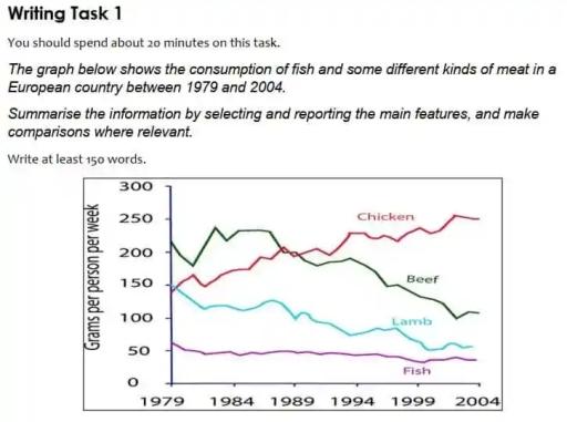
The graph below shows the consumption of fish and some different kinds of meat in a European country between 1979 and 2004
A full IELTS Academic Writing Task 1 answer to this line graph at Band 6.0, 7.0, 8.5, with the four-part structure, the comparison language it needs, and why each version scores what it does.
The question
You should spend about 20 minutes on this task.
The graph below shows the consumption of fish and some different kinds of meat in a European country between 1979 and 2004.
Summarise the information by selecting and reporting the main features, and make comparisons where relevant.
Write at least 150 words.
Consumption of fish and three kinds of meat in a European country, 1979–2004, in grams per person per week.
What to select from this line graph
Four lines over 25 years, but only two things really matter: one line goes up and three go down, and the rising line overtakes the falling one in the late 1980s. That crossover is the single most important feature on the graph and it belongs in the overview. Fish is the trap — it is nearly flat, so candidates either ignore it (losing marks for incomplete coverage) or describe every wobble in it (wasting words on the least significant category).
Structure
Introduction — Paraphrase the rubric: what the graph shows, where, in what units, over what period.
Overview — Two sentences, no exact figures: chicken rose while all three others fell, and chicken replaced beef as the most consumed.
Body 1 — The two categories that changed places — beef and chicken — with the crossover and the figures at each end.
Body 2 — The two that only declined — lamb, which fell steeply, and fish, which was lowest and barely moved.
Model answers
Band 6.0 model answer
167 words
The line graph shows how much fish and three types of meat people ate in a European country from 1979 to 2004. The numbers are in grams per person per week.
In 1979, beef was the most popular food with about 210 grams. Chicken and lamb were both about 150 grams, and fish was the lowest with about 60 grams.
After that, beef went up a little to 240 grams in 1984, but then it decreased. In 1989 it was about 200 grams and in 2004 it was only about 100 grams. Chicken was different because it increased all the time. It reached 200 grams in 1989 and about 250 grams in 2004, so it became the most popular food.
Lamb decreased from 150 grams to about 55 grams in 2004. Fish also decreased but only a little, from 60 grams to about 40 grams, and it was always the smallest of the four.
In conclusion, chicken increased and the other three products decreased during this period.
Why this is Band 6.0
All four categories are covered and the figures are accurate, which is the foundation of Task Achievement, but the overview is mixed in with detail rather than kept separate.
Data is listed category by category with little comparison — the crossover between beef and chicken is mentioned but not identified as the key change.
Vocabulary for trends is adequate but repetitive: increased, decreased and went down do most of the work.
Sentence structures are simple and repetitive, and several sentences begin the same way.
Band 7.0 model answer
219 words
The line graph illustrates the amount of fish, chicken, beef and lamb consumed per person each week in one European country over a twenty-five year period from 1979 to 2004, measured in grams.
Overall, chicken was the only product whose consumption rose, while the other three all fell. The most striking change was the reversal between chicken and beef, with chicken replacing beef as the most widely eaten of the four by the end of the period.
In 1979 beef was clearly dominant at around 210 grams per week, and it rose further to a peak of roughly 240 grams in 1984. From that point it declined steadily, falling to about 200 grams by 1989 and continuing down to only 100 grams in 2004, less than half its original level. Chicken moved in the opposite direction, climbing from approximately 150 grams to 200 grams by 1989 — the point at which it overtook beef — before reaching around 250 grams at the end of the period.
The remaining two categories declined throughout. Lamb, which began level with chicken at about 150 grams, fell consistently to roughly 55 grams by 2004. Fish was the least consumed product in every year, and although it also decreased, the change was far more modest, slipping from around 60 grams to just above 40.
Why this is Band 7.0
The overview is separate, comes early and contains no exact numbers — the structural feature examiners look for first in Task 1.
Categories are grouped by behaviour (the pair that changed places, then the pair that only fell) rather than listed one by one.
Comparison language is used properly: whereas, by contrast, overtook, the same period.
A range of structures including participle clauses and a relative clause; figures are integrated into sentences rather than stacked.
Band 8.5 model answer
213 words
The line graph compares weekly per-capita consumption of chicken, beef, lamb and fish in a European country between 1979 and 2004, measured in grams.
Overall, the four categories diverged sharply: chicken consumption rose substantially while all three of the others declined. The defining development was the exchange of positions between chicken and beef, which crossed towards the end of the 1980s and left chicken as comfortably the most consumed product by 2004.
Beef and chicken effectively traded places over the period. Beef opened as the clear leader at roughly 210 grams, peaked at around 240 grams in 1984, and then fell away persistently, ending at approximately 100 grams — a little under half its starting figure. Chicken, beginning at about 150 grams, climbed almost without interruption, drawing level with beef at around 200 grams in 1989 and continuing upwards to some 250 grams by the close of the period.
The other two products fell throughout, though at very different rates. Lamb, which started level with chicken at roughly 150 grams, declined steadily to about 55 grams, giving up almost two thirds of its original share. Fish, by contrast, was the least eaten product in every single year and changed the least, tailing off only marginally from around 60 grams to just over 40.
Why this is Band 8.5
The overview selects rather than summarises: it names the divergence and the crossover as the two defining features and leaves everything else for the body.
Groupings are justified by the data — the pair that traded places, then the pair that only declined — and each body paragraph makes an explicit comparison rather than reporting two separate stories.
Fish is handled proportionately: covered accurately in one clause, with its significance (lowest throughout, least changed) stated rather than its every fluctuation described.
Lexis is precise and varied — diverged, peaked, tailed off, marginal, a little over half — with accurate approximation language throughout.
Complex structures are used flexibly and economically: participle clauses, an appositive, and a fronted adverbial, with figures embedded rather than listed.
Model answers written and reviewed by The English All-in-One IELTS team. They are teaching models showing what each band looks like, not real candidate scripts.
This is a line graph question. The answers above show you what each band looks like when it is finished. What they cannot show you is how to get there from a blank page in forty minutes.
That is what our Writing Study Library is for: the structure we teach for this exact question type, the paragraph pattern that goes with it, and the sentence openers for each stage — so the essay is planned before you start writing rather than assembled as you go.
Yes — leaving a category out is incomplete coverage and costs you under Task Achievement. But coverage does not mean equal space. Fish barely moves, so one accurate clause noting that it was lowest throughout and changed least is proportionate; describing its every fluctuation wastes words that the important comparison needs.
Should the overview contain numbers?
No. The overview is where you state the main features without data — what rose, what fell, what the biggest change was. Putting figures in it is the most common structural error in Task 1, because it leaves you with nothing distinct to say in the body paragraphs.
Is a conclusion needed in Task 1?
No. Task 1 needs an overview, not a conclusion, and a separate conclusion usually just repeats it. If you have written a proper overview after the introduction, stop when the data is covered — the Band 8.5 model here has no conclusion at all.
How exact do my figures need to be?
Approximate is expected and safer. Use <em>approximately</em>, <em>roughly</em>, <em>just over</em>, <em>a little under</em> — reading a value off a graph to the exact gram is neither possible nor rewarded, and confident approximation language demonstrates control.
How long should Task 1 be?
At least 150 words; around 170 to 190 is a good target. Below 150 there is an automatic penalty. Going much beyond 200 usually means you are describing every data point instead of selecting, which is itself penalised under Task Achievement.