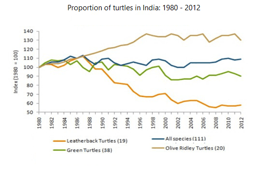
The graph below shows the population figures for different types of turtles in India from 1980 to 2012
A full IELTS Academic Writing Task 1 answer to this line graph at Band 6.0, 7.0, 8.5, with the four-part structure, the comparison language it needs, and why each version scores what it does.
The question
You should spend about 20 minutes on this task.
The graph below shows the population figures for different types of turtles in India from 1980 to 2012.
Summarise the information by selecting and reporting the main features, and make comparisons where relevant.
Write at least 150 words.
Turtle populations in India, 1980–2012, indexed to 1980 = 100.
What to select from this line graph
The vertical axis is an index set to 100 in 1980, not a count of animals, so every statement must be about relative change rather than about how many turtles there are. The most valuable observation is that the combined line stays almost flat while the individual species move in opposite directions — an aggregate that conceals a collapse in one species and a recovery in another. Saying that explicitly is what separates a Band 8 answer here.
Structure
Introduction — Paraphrase: what is measured, where, over what period, and that figures are indexed to 1980.
Overview — No detail: the combined figure changed very little, but this masks sharp divergence, with Olive Ridley numbers rising substantially and leatherbacks falling by roughly half.
Body 1 — The two extremes — Olive Ridley rising and leatherback declining.
Body 2 — Green turtles and the all-species line, and how the aggregate conceals the rest.
Model answers
Band 6.0 model answer
181 words
The line graph shows the population of three types of turtles and of all species together in India between 1980 and 2012. The numbers are an index and 1980 is equal to 100.
Olive Ridley turtles increased the most. Their index was 100 in 1980 and it increased to about 120 in 1990 and about 135 in 2000. After that it stayed high and finished at about 130 in 2012.
Leatherback turtles decreased all the time. Their index was 100 in 1980, but it fell to about 90 in 1990, then to 70 in 1998 and finally to only about 57 in 2012, so they lost almost half.
Green turtles first increased a little to about 110 in 1990, but after that they decreased to about 85 in 2002 and finished at about 90.
The line for all species did not change very much. It stayed between 100 and 110 during all the period and finished at about 108.
In conclusion, Olive Ridley turtles increased and leatherback turtles decreased a lot, but the line for all species was almost the same.
Why this is Band 6.0
All four lines are covered with accurate figures, which secures Task Achievement at this level.
The index is mentioned but the answer occasionally slips into talking about numbers of turtles rather than relative change.
Vocabulary is adequate but repetitive: increased, decreased and number recur throughout.
Sentences are mainly simple and compound, with limited variation.
Band 7.0 model answer
218 words
The line graph shows changes in the populations of three turtle species in India, together with a combined figure for all species, between 1980 and 2012. All values are indexed to 1980, which is set at 100.
Overall, the combined figure for all species altered remarkably little across the period, but this conceals sharply divergent trends beneath it: Olive Ridley numbers rose substantially while leatherbacks fell by close to half.
The two extremes moved steadily apart. Olive Ridley turtles climbed almost continuously, reaching an index of around 120 by 1990 and approximately 135 by 2000, after which the figure levelled off and ended at about 130 — some thirty per cent above its 1980 level. Leatherbacks moved in the opposite direction throughout, slipping to roughly 90 by 1990, falling more steeply to about 70 by 1998, and finishing at approximately 57, meaning the population had contracted by well over forty per cent.
Green turtles followed a middle path, rising modestly to around 110 by 1990 before declining to about 85 in the mid-2000s and recovering slightly to roughly 90 by 2012. The all-species line, meanwhile, remained within a narrow band between 100 and 110 for the entire period, ending at approximately 108 — a figure which, taken alone, would give no indication of the collapse in leatherback numbers.
Why this is Band 7.0
The overview is separate, arrives early and identifies that the flat aggregate conceals divergence between species.
The index basis is handled correctly, with all statements framed as relative change.
Comparison language is accurate: diverged, by contrast, masks, roughly half.
Species are grouped by direction of change rather than described one at a time.
Band 8.5 model answer
261 words
The line graph traces changes in the populations of three turtle species in India, and in all species combined, from 1980 to 2012. Values are indexed to 1980 = 100, so the graph records relative change rather than the number of animals.
Overall, the combined figure barely moved across the thirty-two years, but that stability is misleading: the individual species diverged sharply, with Olive Ridley numbers rising by around a third while leatherbacks lost close to half their population. The aggregate line therefore conceals rather than summarises what happened.
The two extremes account for almost all of the movement. Olive Ridley turtles rose almost without interruption, passing an index of 120 by 1990 and peaking at approximately 137 around the turn of the century, before levelling off and closing at about 130. Leatherbacks declined across the entire period and did so steadily: to roughly 90 by 1990, about 70 by 1998, and eventually some 57 by 2012 — a contraction of more than forty per cent, and the only species never to record a sustained recovery.
Green turtles occupied the middle ground, briefly rising to around 110 in the late 1980s before falling back to approximately 85 in the mid-2000s and edging up to about 90 at the end. The all-species figure, by contrast, held within a narrow range of roughly 100 to 110 throughout, finishing near 108. Read on its own it would suggest a stable population, which is precisely why the individual series matter: the modest aggregate gain is the arithmetic result of one species expanding while another halved.
Why this is Band 8.5
The overview names the central analytical point — a stable aggregate concealing opposite movements — which is the single most valuable observation available.
Handles the index basis explicitly and consistently, so no claim is made about absolute population size.
Groups the lines by direction and quantifies relative change rather than only reporting endpoints.
Lexis is precise and economical: indexed, diverged, aggregate, conceals, contracted, levelled off.
Complex structures are used flexibly, including a fronted concessive, an appositive and a participle clause, with figures embedded naturally.
Model answers written and reviewed by The English All-in-One IELTS team. They are teaching models showing what each band looks like, not real candidate scripts.
This is a line graph question. The answers above show you what each band looks like when it is finished. What they cannot show you is how to get there from a blank page in forty minutes.
That is what our Writing Study Library is for: the structure we teach for this exact question type, the paragraph pattern that goes with it, and the sentence openers for each stage — so the essay is planned before you start writing rather than assembled as you go.
What does it mean when the axis says 'Index (1980 = 100)'?
Every value is expressed relative to that year, so 130 means thirty per cent above the 1980 level, not 130 turtles. You can describe growth and decline freely, but you cannot say one species is more numerous than another — the graph deliberately removes that information.
Should I write about the combined line as well as the individual ones?
Yes, and here it is one of the most interesting features. Noting that the total barely moved while its components moved in opposite directions is a genuine finding, and it explains why an average can be misleading — exactly the kind of observation examiners reward as selection.
How do I describe a line that rises and then flattens?
Name both phases and where the change happens: "rose almost without interruption until around 2000, then levelled off". Describing it as a single rise loses a real feature; describing every small wobble loses marks for selection.
Can I say which species is doing best?
You can say which grew most and which declined most, since that is what the index measures. Avoid saying which is most numerous or which is most endangered — neither follows from an indexed chart, and both would be claims beyond the data.