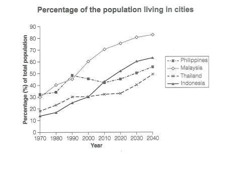
The graph below gives information about the percentage of the population in four Asian countries living in cities from 1970 to 2020, with prediction for 2030 and 2040
A full IELTS Academic Writing Task 1 answer to this line graph at Band 6.0, 7.0, 8.5, with the four-part structure, the comparison language it needs, and why each version scores what it does.
The question
You should spend about 20 minutes on this task.
The graph below gives information about the percentage of the population in four Asian countries living in cities from 1970 to 2020, with prediction for 2030 and 2040.
Summarise the information by selecting and reporting the main features, and make comparisons where relevant.
Write at least 150 words.
Percentage of the population living in cities in four Asian countries, 1970–2020, with projections to 2040.
What to select from this line graph
Four lines over seventy years, and the temptation is to describe each one in turn. The reportable structure is different: all four rise overall, so the interesting facts are which rose fastest, which changed rank, and which is the odd one out. The Philippines is the only line to fall at any point, and Indonesia climbs from the very bottom to second place — those two facts carry most of the marks. Note also that the later part of the graph is projection rather than record, and your language should reflect that.
Structure
Introduction — Paraphrase: what is measured, in which four countries, over what span, noting that the later years are forecasts.
Overview — No figures: urbanisation rises in all four countries, Malaysia leads throughout, and Indonesia shows by far the largest change, overtaking two countries on the way.
Body 1 — Malaysia and Indonesia — the leader and the fastest riser, and the point at which Indonesia moves into second place.
Body 2 — The Philippines and Thailand — the slower pair, including the Philippine decline between 1990 and 2010.
Model answers
Band 6.0 model answer
203 words
The line graph shows the percentage of people living in cities in four Asian countries between 1970 and 2040.
Malaysia had the highest percentage in almost all the period. It started at about 33 per cent in 1970 and increased quickly to 61 per cent in 2000 and 71 per cent in 2010. In 2040 it will be about 83 per cent, which is the highest number on the graph.
Indonesia started at only about 15 per cent, which was the lowest, but it increased a lot. In 2000 it reached 40 per cent and in 2020 about 53 per cent, so it became the second country. In 2040 it will be about 64 per cent.
The Philippines started at about 32 per cent and increased to 49 per cent in 1990, but after that it decreased to about 44 per cent in 2010. Then it increased again and will be about 56 per cent in 2040.
Thailand was always low. It was 21 per cent in 1970 and only 33 per cent in 2010, and it will be about 49 per cent in 2040.
In conclusion, the percentage of city population increased in all four countries, and Indonesia had the biggest change.
Why this is Band 6.0
All four countries are covered with accurate figures at the start and end, which secures Task Achievement at this level.
The countries are described one after the other, so the changes in rank are reported but not treated as the main feature.
Vocabulary is adequate but repetitive: increased, percentage and country do most of the work.
The distinction between recorded data and forecast is not made, and sentence structures are largely simple and compound.
Band 7.0 model answer
246 words
The line graph compares the proportion of the population living in cities in Malaysia, the Philippines, Thailand and Indonesia between 1970 and 2020, with projections extending to 2040.
Overall, urbanisation increases in all four countries across the period, but at very different rates. Malaysia is consistently the most urbanised, while Indonesia records by far the greatest change, rising from the lowest position to the second highest.
Malaysia began at approximately 33 per cent in 1970, close to the Philippines, but pulled clearly ahead from 1990 onwards, reaching around 61 per cent by 2000 and 71 per cent by 2010. It is projected to continue rising more gently to roughly 83 per cent by 2040. Indonesia followed a much steeper path from a far lower base of about 15 per cent, climbing sharply after 1990 to approximately 40 per cent in 2000 and overtaking both Thailand and the Philippines in the process. By 2040 it is expected to reach around 64 per cent.
The other two countries advanced more slowly. The Philippines is the only country to show a reversal, rising to about 49 per cent by 1990 before falling back to roughly 44 per cent in 2010 and then recovering to a projected 56 per cent. Thailand grew steadily but modestly, from around 21 per cent to only about 33 per cent by 2010, though a sharper rise to approximately 49 per cent is forecast thereafter — leaving it the least urbanised of the four throughout.
Why this is Band 7.0
The overview is separate, arrives early and identifies Malaysia's leadership and Indonesia's transformation as the main features.
Countries are paired by behaviour rather than listed, which produces comparison.
The forecast portion is distinguished from the recorded data by tense and hedging.
Less common lexis is used accurately: urbanisation, overtook, projected, reversal.
Band 8.5 model answer
301 words
The line graph compares the percentage of the population living in cities in four Asian countries from 1970 to 2020, together with projected figures through to 2040.
Overall, every country becomes substantially more urbanised across the seventy years, but the ranking changes considerably. Malaysia is the most urbanised throughout and remains so, whereas Indonesia undergoes much the largest transformation, climbing from the lowest position in 1970 to the second highest by the end of the projection. Only the Philippines interrupts the general upward pattern.
Malaysia and Indonesia account for the steepest trajectories. Malaysia started at roughly 33 per cent, level with the Philippines, but accelerated from 1990, passing 61 per cent in 2000 and 71 per cent in 2010 before its growth slows; it is forecast to reach approximately 83 per cent by 2040. Indonesia rose from the lowest base of all — about 15 per cent, less than half the Malaysian figure — and gained momentum after 1990, reaching around 40 per cent by 2000 and overtaking both Thailand and the Philippines. Its projected figure of some 64 per cent by 2040 represents a rise of roughly fifty percentage points, the largest change on the graph.
The remaining two moved more slowly and provide the only anomaly. The Philippines climbed to approximately 49 per cent by 1990, at that point the second most urbanised, but then declined for two decades to about 44 per cent in 2010 — the sole fall recorded anywhere on the chart — before resuming growth towards a projected 56 per cent. Thailand advanced most gradually of all, from around 21 per cent to only about 33 per cent by 2010, and although a sharper increase to roughly 49 per cent is forecast, it is expected to remain the least urbanised of the four in 2040.
Why this is Band 8.5
The overview selects the two features that organise the whole graph — the constant leader and the country that changes rank most — without listing figures.
Handles the projection boundary explicitly and shifts to forecast language at the right point, which most answers overlook entirely.
Identifies the Philippine dip as the single anomaly and quantifies the rank changes rather than merely noting them.
Lexis is precise and economical: urbanisation, trajectory, anomaly, projected, from the lowest base.
Complex structures are used flexibly, including a fronted concessive, an appositive and a participle clause, with figures embedded naturally.
Model answers written and reviewed by The English All-in-One IELTS team. They are teaching models showing what each band looks like, not real candidate scripts.
This is a line graph question. The answers above show you what each band looks like when it is finished. What they cannot show you is how to get there from a blank page in forty minutes.
That is what our Writing Study Library is for: the structure we teach for this exact question type, the paragraph pattern that goes with it, and the sentence openers for each stage — so the essay is planned before you start writing rather than assembled as you go.
Say so in the introduction and change your language for that section: <em>is projected to</em>, <em>is expected to reach</em>, <em>is forecast at</em>. Reporting a 2040 estimate in the past tense is a factual error, and marking the boundary correctly is a small but reliable signal of accuracy.
Four lines is a lot — how do I organise them?
Pair them by behaviour, not by name. Here the two fast risers belong together and the two slower ones belong together, which lets each paragraph make comparisons instead of delivering four separate accounts.
Should I mention a country that changed position in the ranking?
Yes — changes in rank are among the most reportable features of a multi-line graph, and they are invisible if you describe each line in isolation. Indonesia overtaking two countries is more interesting than any single figure on this chart.
What if one line behaves differently from the rest?
Highlight it. The Philippine dip is the only fall anywhere on the graph, which makes it a main feature despite being a small movement. Identifying the exception to a general pattern is exactly what selection means.