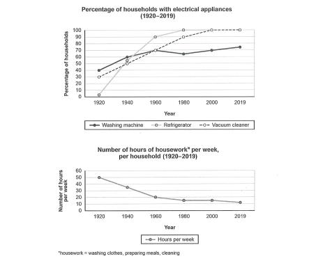
The charts below show the changes in ownership of electrical appliances and amount of time spent doing housework in households in one country between 1920 and 2019
A full IELTS Academic Writing Task 1 answer to this line graph at Band 6.0, 7.0, 8.5, with the four-part structure, the comparison language it needs, and why each version scores what it does.
The question
You should spend about 20 minutes on this task.
The charts below show the changes in ownership of electrical appliances and amount of time spent doing housework in households in one country between 1920 and 2019.
Summarise the information by selecting and reporting the main features, and make comparisons where relevant.
Write at least 150 words.
Household ownership of three electrical appliances, and weekly hours of housework per household, 1920–2019.
What to select from this line graph
Two charts that plainly relate to each other, and the strongest answer says so: appliance ownership rose while housework hours fell, with almost all of both changes happening in the same forty-year window. Be careful how you word that — the charts show the two moving together, not that one caused the other. The other feature worth catching is that washing machines never reached saturation while the other two did.
Structure
Introduction — Paraphrase both charts and the period they cover.
Overview — No figures: ownership of all three appliances rose while housework hours fell sharply, with most of the movement in both occurring before 1980.
Body 1 — The appliances — two reaching universal ownership, one levelling off well below it.
Body 2 — Housework hours — the steep early fall and the plateau afterwards, set against the appliance data.
Model answers
Band 6.0 model answer
202 words
The first line graph shows how many households had three electrical appliances between 1920 and 2019, and the second graph shows how many hours of housework people did every week in the same period.
In 1920 only about 5 per cent of households had a refrigerator, but about 40 per cent had a washing machine and about 30 per cent had a vacuum cleaner.
After that the refrigerator increased very quickly. In 1960 it was about 90 per cent and in 2000 it reached 100 per cent. The vacuum cleaner also increased to about 95 per cent in 1980 and 100 per cent in 2000.
The washing machine increased more slowly. It was about 72 per cent in 1960 and after that it did not change very much, and in 2019 it was only about 75 per cent.
The second graph shows that the number of hours decreased a lot. In 1920 people did about 50 hours of housework every week, but in 1960 only about 20 hours. After 1980 the number stayed at about 15 hours and in 2019 it was about 14 hours.
In conclusion, when more households bought electrical appliances, the number of hours of housework became much smaller.
Why this is Band 6.0
Both charts are covered with accurate figures at the key points, which secures Task Achievement at this level.
The two charts are described separately and the relationship between them is stated only briefly at the end.
Vocabulary is adequate but repetitive: increased, percentage and hours recur throughout.
Sentences are mainly simple and compound, with figures presented one per clause.
Band 7.0 model answer
243 words
The two line graphs show the percentage of households owning three electrical appliances and the number of hours of housework performed weekly per household, both between 1920 and 2019.
Overall, ownership of all three appliances rose substantially while housework hours fell steeply, and in both cases the great majority of the change occurred before 1980. Two of the appliances eventually became universal, whereas the third levelled off well short of that.
Refrigerators showed the most dramatic growth, starting from only around 5 per cent of households in 1920 — by far the lowest figure on the chart — and climbing steeply to approximately 90 per cent by 1960 and effectively 100 per cent by 2000. Vacuum cleaners followed a similar if less extreme path, rising from about 30 per cent to around 95 per cent by 1980 and reaching universal ownership thereafter. Washing machines began as the most common appliance at roughly 40 per cent, but grew far more slowly, reaching about 72 per cent by 1960 and then plateauing, finishing at only around 75 per cent in 2019.
Housework hours moved correspondingly in the opposite direction. From approximately 50 hours per week in 1920, the figure fell to around 40 by 1940 and then sharply to about 20 by 1960 — a reduction of well over half in forty years. The decline then almost stopped, with the figure settling near 15 hours from 1980 onwards and standing at roughly 14 in 2019.
Why this is Band 7.0
The overview is separate, arrives early and links the two charts by noting that both changed most in the same period.
The three appliances are grouped by outcome — two reaching saturation, one not — rather than described in turn.
The relationship between the charts is expressed as correlation rather than cause.
Less common lexis is used accurately: ownership, plateau, universal, correspondingly.
Band 8.5 model answer
286 words
The two line graphs show, over the period from 1920 to 2019, the proportion of households owning three electrical appliances and the number of hours of housework carried out each week per household.
Overall, appliance ownership rose while housework hours fell, and the two movements coincided closely: in both charts the great majority of the change had taken place by 1980, after which each series was comparatively flat. Refrigerators and vacuum cleaners eventually reached every household, whereas washing machines did not.
The appliances began the period in very different positions. Refrigerators were owned by only about 5 per cent of households in 1920 but grew fastest of the three, passing roughly 90 per cent by 1960 and becoming effectively universal by 2000. Vacuum cleaners rose from around 30 per cent to some 95 per cent by 1980 and likewise reached near-total ownership. Washing machines are the exception: the most widely owned appliance in 1920 at approximately 40 per cent, they climbed to about 72 per cent by 1960 and then essentially stopped, ending at only around 75 per cent — the sole appliance never to approach saturation.
Housework hours declined over the same span and in the same shape. The weekly figure stood at roughly 50 hours in 1920, eased to about 40 by 1940, and then fell steeply to approximately 20 by 1960, losing more than half its original level in four decades. Thereafter the reduction largely ceased: the figure settled at around 15 hours by 1980 and moved only marginally to about 14 by 2019. The period of most rapid appliance adoption and the period of steepest decline in housework are therefore the same, although the charts show only that the two moved together.
Why this is Band 8.5
The overview identifies that both charts change most in the same window, which is the observation that connects them.
Groups the appliances by whether they reached saturation, and treats the washing machine as the exception it is.
States the relationship between the charts carefully as correlation, avoiding an unsupported causal claim.
Lexis is precise and economical: saturation, plateau, correspondingly, coincided with, near-universal.
Complex structures are used flexibly, including a fronted concessive, an appositive and a participle clause, with figures embedded naturally.
Model answers written and reviewed by The English All-in-One IELTS team. They are teaching models showing what each band looks like, not real candidate scripts.
This is a line graph question. The answers above show you what each band looks like when it is finished. What they cannot show you is how to get there from a blank page in forty minutes.
That is what our Writing Study Library is for: the structure we teach for this exact question type, the paragraph pattern that goes with it, and the sentence openers for each stage — so the essay is planned before you start writing rather than assembled as you go.
Can I say the appliances caused housework to fall?
No — and the distinction matters. The charts show the two moving together over the same period, which is correlation. Write "coincided with" or "moved correspondingly", not "because of". Asserting cause is going beyond the data and is a genuine accuracy issue, not a stylistic preference.
How do I connect two charts that clearly relate?
Use the overview. Noting that both changed most before 1980 and then flattened links them in a single sentence without claiming anything the data does not support, and it gives your answer a shape that two separate descriptions would lack.
What should I do with a line that stops rising?
Treat it as a main feature. The washing machine is the only appliance never to reach saturation, which is more interesting than any of its individual figures, and an answer that reports all three as simply rising has missed the most reportable difference between them.
Do I need figures for every year marked?
No. Give values at the start, at any turning point, and at the end. Reporting all six points for all four lines would be twenty-four numbers and would leave no room for the comparisons that actually earn marks.