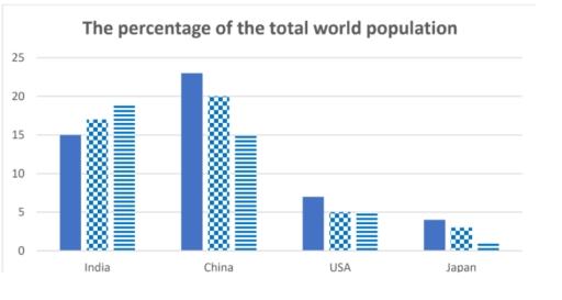
The bar chart shows the percentage of the total world population in 4 countries in 1950 and 2003, and projections for 2050
A full IELTS Academic Writing Task 1 answer to this bar chart at Band 6.0, 7.0, 8.5, with the four-part structure, the comparison language it needs, and why each version scores what it does.
The question
You should spend about 20 minutes on this task.
The bar chart shows the percentage of the total world population in 4 countries in 1950 and 2003, and projections for 2050.
Summarise the information by selecting and reporting the main features, and make comparisons where relevant.
Write at least 150 words.
Percentage of the total world population living in four countries in 1950 and 2003, with projections for 2050.
What to select from this bar chart
The reportable event is the crossover: China begins well ahead of India and is projected to finish well behind it, and India is the only country of the four whose share rises at all. Two cautions. These are shares of the world total, so a falling share does not mean a falling population — the world is growing underneath them. And the third bar is a projection, so it needs future language.
Structure
Introduction — Paraphrase: what is measured, for which four countries, in which years, and note the last is a projection.
Overview — No figures: India is the only country whose share rises and is projected to overtake China, while all three of the others decline.
Body 1 — China and India — the crossover, with figures at each point.
Body 2 — The USA and Japan — smaller shares, both falling, with Japan's proportional collapse noted.
Model answers
Band 6.0 model answer
180 words
The bar chart shows what percentage of the world population lived in four countries in 1950 and 2003, and what the percentage will be in 2050.
In 1950 China had the biggest percentage with about 23 per cent. India was the second with about 15 per cent, the USA had about 7 per cent and Japan only about 4 per cent.
In 2003 China decreased to about 20 per cent but it was still the first. India increased to about 17 per cent, the USA decreased to about 5 per cent and Japan decreased to about 2 per cent.
In 2050 the situation will be different. China will decrease to about 15 per cent and India will increase to about 19 per cent, so India will become the first country.
The USA will stay at about 5 per cent and Japan will decrease again to only about 1 per cent, which is the smallest number in the chart.
In conclusion, India is the only country where the percentage increased, and China, the USA and Japan all decreased during this period.
Why this is Band 6.0
All four countries are covered across the three years with accurate figures, which secures Task Achievement at this level.
The countries are described one after the other and the crossover is noted late rather than in the overview.
The projection is reported in the past tense in places, so the distinction between record and forecast is not maintained.
Vocabulary is adequate but repetitive, with per cent, population and decreased recurring.
Band 7.0 model answer
230 words
The bar chart compares the share of the total world population living in India, China, the USA and Japan in 1950 and 2003, together with projections for 2050.
Overall, India is the only one of the four countries whose share of the global population rises across the period, and it is projected to overtake China by 2050. The other three all decline, with Japan falling most steeply in proportional terms.
China and India dominate the chart and effectively change places. China held much the largest share in 1950 at approximately 23 per cent, some eight points ahead of India's 15 per cent. By 2003 the gap had narrowed considerably, to around 20 per cent against 17 per cent, and by 2050 the positions are expected to be reversed, with India at roughly 19 per cent and China down to about 15 per cent — a fall of eight points across the century.
The remaining two countries account for much smaller shares and both contract. The United States is projected to slip from around 7 per cent in 1950 to about 5 per cent in 2003, remaining at that level in 2050. Japan's decline is the sharpest relative to its size: from approximately 4 per cent to 2 per cent and then to just 1 per cent, meaning its share is expected to fall to a quarter of the 1950 figure.
Why this is Band 7.0
The overview is separate, arrives early and identifies India as the sole riser and the projected crossover with China.
The countries are grouped as a leading pair and a smaller pair rather than described in turn.
Future forms are used consistently for the 2050 figures.
Less common lexis is used accurately: share, overtake, projected, proportionally.
Band 8.5 model answer
274 words
The bar chart compares the proportion of the world's population living in four countries in 1950 and 2003, with projected figures for 2050. Because these are shares of a growing global total, a declining bar indicates a falling share rather than necessarily a falling population.
Overall, India is alone among the four in gaining share, and is projected to displace China as the most populous of them by 2050. All three of the others contract, with Japan's decline much the steepest in proportional terms.
The two Asian giants account for most of the movement and are expected to exchange positions. China began well ahead in 1950 at roughly 23 per cent against India's 15, a lead of some eight percentage points. That advantage had narrowed to about three points by 2003, at 20 per cent against 17, and is projected to reverse entirely by 2050, when India should reach approximately 19 per cent while China falls to around 15. China therefore loses about a third of its share over the century, while India gains roughly a quarter of its own.
The Western and Japanese figures are smaller and both trend downwards. The United States is shown falling from around 7 per cent to about 5 per cent by 2003 and holding at that level in the projection, making it the most stable of the four over the second half of the period. Japan contracts most sharply relative to where it started, from approximately 4 per cent to 2 and then to just 1 per cent — a projected reduction to a quarter of its 1950 share, and the smallest figure anywhere on the chart.
Why this is Band 8.5
The overview names the crossover and India's uniqueness, which together summarise the chart without figures.
Notes explicitly that these are shares of a growing world total, so a falling share does not imply a falling population.
Handles the projection boundary with consistent future language and distinguishes absolute from proportional decline.
Lexis is precise and economical: share, projected, overtake, proportionally, contract.
Complex structures are used flexibly, including a fronted concessive, an appositive and a participle clause, with figures embedded naturally.
Model answers written and reviewed by The English All-in-One IELTS team. They are teaching models showing what each band looks like, not real candidate scripts.
This is a bar chart question. The answers above show you what each band looks like when it is finished. What they cannot show you is how to get there from a blank page in forty minutes.
That is what our Writing Study Library is for: the structure we teach for this exact question type, the paragraph pattern that goes with it, and the sentence openers for each stage — so the essay is planned before you start writing rather than assembled as you go.
Does a falling percentage mean the population is shrinking?
No, and this is the trap on any chart of world shares. The global total is rising underneath, so a country can grow in absolute numbers while its share falls. Say "its share declined" rather than "its population fell" and the statement stays accurate.
How do I handle the projected column?
Switch to future or modal forms — <em>is projected to</em>, <em>should reach</em>, <em>is expected to</em> — and say in the introduction that the last figures are estimates. Reporting a 2050 projection in the past tense is a factual error examiners notice immediately.
Should I mention the crossover between India and China?
It is the main feature of the chart and belongs in the overview. A reversal of ranking is far more reportable than any individual figure, and it is invisible if you describe each country separately.
Is an eight-point fall bigger than a three-point fall?
In absolute terms yes, but not necessarily proportionally. China loses eight points from a base of twenty-three, roughly a third; Japan loses three points from a base of four, or three quarters. Saying which measure you mean is what keeps the comparison honest.