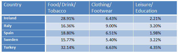
The table below gives information on consumer spending on different iters in five different countries in 2002
A full IELTS Academic Writing Task 1 answer to this table at Band 6.0, 7.0, 8.5, with the four-part structure, the comparison language it needs, and why each version scores what it does.
The question
You should spend about 20 minutes on this task.
The table below gives information on consumer spending on different iters in five different countries in 2002.
Summarise the information by selecting and reporting the main features, and make comparisons where relevant.
Write at least 150 words.
Consumer spending on three categories in five countries, 2002, as percentages.
What to select from this table
Only three columns, so the marks come from comparing countries rather than listing them. The reportable structure is that one column varies enormously while the other two barely move: food, drink and tobacco spans sixteen percentage points, whereas clothing spans under four. Note also that these percentages cover only three categories and do not sum to 100 — the rest of each country's spending is simply not shown, so no claim can be made about total expenditure.
Structure
Introduction — Paraphrase: what is measured, in which five countries, in which year, and that figures are percentages.
Overview — No detail: food, drink and tobacco takes much the largest share everywhere and varies most between countries, while leisure and education is consistently the smallest.
Body 1 — The food column — the range from Turkey down to Sweden, and how it dominates every country.
Body 2 — The two smaller columns, where differences between countries are far narrower.
Model answers
Band 6.0 model answer
178 words
The table shows how much people in five different countries spent on three categories of products in 2002. The numbers are percentages.
In Ireland, people spent 28.91 per cent on food, drink and tobacco, 6.43 per cent on clothing and footwear and only 2.21 per cent on leisure and education.
In Italy the percentage for food was much lower, only 16.36 per cent, but the percentage for clothing was the highest of all the countries with 9 per cent. Leisure and education was 3.20 per cent.
In Spain people spent 18.80 per cent on food, 6.51 per cent on clothing and 1.98 per cent on leisure, which was the smallest number in the table.
Sweden had the lowest percentage for food with 15.77 per cent and also the lowest for clothing with 5.40 per cent. Turkey had the highest percentage for food with 32.14 per cent and also the highest for leisure with 4.35 per cent.
In conclusion, people in all five countries spent much more money on food, drink and tobacco than on the other two categories.
Why this is Band 6.0
All five countries and three categories are covered with accurate figures, which secures Task Achievement at this level.
The table is read country by country rather than column by column, so the comparison is left to the reader.
Vocabulary is adequate but repetitive: spent, per cent and country recur throughout.
Sentences are mainly simple and compound, with one figure per clause.
Band 7.0 model answer
204 words
The table compares the percentage of consumer spending devoted to three categories of goods in five countries in 2002.
Overall, food, drink and tobacco absorbed by far the largest share of spending in every country, and it was also the category in which the countries differed most. Leisure and education took the smallest share everywhere.
Spending on food, drink and tobacco ranged from 15.77 per cent in Sweden to 32.14 per cent in Turkey — a spread of over sixteen percentage points, meaning the Turkish figure was roughly double the Swedish one. Ireland was closer to Turkey at 28.91 per cent, while Italy and Spain occupied the middle ground at 16.36 and 18.80 per cent respectively.
The other two categories varied far less. Clothing and footwear fell within a narrow band from 5.40 per cent in Sweden to 9.00 per cent in Italy, with the remaining three countries all between 6.43 and 6.63 per cent. Leisure and education was smaller still, ranging only from 1.98 per cent in Spain to 4.35 per cent in Turkey. It should be noted that these three categories do not account for all spending, so the table says nothing about how the remainder of each country's expenditure was distributed.
Why this is Band 7.0
The overview is separate, arrives early and identifies both the dominance of the food column and the fact that it varies most.
The table is read by column rather than by country, which produces comparison rather than description.
Comparison language is accurate: by far the largest, a range of, whereas, the narrowest spread.
The limits of the data are noted, so no claim is made about total spending.
Band 8.5 model answer
266 words
The table compares the proportion of consumer spending allocated to three categories of goods across five countries in 2002. Since the three columns together account for well under half of expenditure in every case, the table describes priorities within those categories rather than total spending.
Overall, food, drink and tobacco dominated in all five countries, taking at least two and a half times the share of either other category everywhere. It was also much the most variable column: countries differed by over sixteen percentage points here, against under four for clothing and under three for leisure.
Turkey devoted the greatest share to food, drink and tobacco at 32.14 per cent, closely followed by Ireland at 28.91 per cent. At the other end, Sweden spent 15.77 per cent — less than half the Turkish figure — with Italy at 16.36 per cent only marginally higher. Spain sat between the two groups at 18.80 per cent, so the five countries divide into a higher-spending pair, a lower-spending pair and one intermediate case.
The remaining categories show far less variation. Clothing and footwear was tightly clustered, with Ireland, Spain and Turkey within 0.2 of a point of one another at around 6.5 per cent, Sweden slightly below at 5.40 per cent, and Italy the only outlier at 9.00 per cent — the highest figure in that column and notably the country with the second-lowest food share. Leisure and education attracted the smallest proportion everywhere, from 1.98 per cent in Spain to 4.35 per cent in Turkey, which is the only country to lead in two of the three categories.
Why this is Band 8.5
The overview selects both the dominance of one column and the difference in how much each column varies, which is the structural insight in the table.
Compares by column and quantifies the spread, so the reader learns something no individual cell shows.
States explicitly that the three categories do not sum to 100, preventing a common false inference.
Lexis is precise and economical: spread, absorbed, tightly clustered, outlier, marginal.
Complex structures are used flexibly, including an appositive, a participle clause and a fronted adverbial, with figures embedded naturally.
Model answers written and reviewed by The English All-in-One IELTS team. They are teaching models showing what each band looks like, not real candidate scripts.
This is a table question. The answers above show you what each band looks like when it is finished. What they cannot show you is how to get there from a blank page in forty minutes.
That is what our Writing Study Library is for: the structure we teach for this exact question type, the paragraph pattern that goes with it, and the sentence openers for each stage — so the essay is planned before you start writing rather than assembled as you go.
Should I read a table across the rows or down the columns?
Down the columns, almost always. Reading across gives you one paragraph per country and no comparison; reading down lets you rank the countries within each category and describe how much they differ, which is what the task asks for.
What if the percentages do not add up to 100?
Say so once, briefly, and be careful what you claim. Here the three columns cover only part of each country's spending, so you can compare priorities between countries but cannot say anything about total expenditure or about what else people bought.
Is it worth mentioning how much the countries differ?
It is one of the strongest observations available. Noting that one category varies by sixteen points while another varies by four tells the reader something no single figure does, and it justifies which column you spend most words on.
Can I group countries together?
Yes, when the data supports it. Describing a higher-spending pair, a lower-spending pair and one country in between is far more informative than five separate sentences, and it demonstrates the selection that Task Achievement rewards.