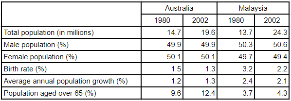
The table below gives information about population in Australia and Malaysia in 1980 and 2002
A full IELTS Academic Writing Task 1 answer to this table at Band 6.0, 7.0, 8.5, with the four-part structure, the comparison language it needs, and why each version scores what it does.
The question
You should spend about 20 minutes on this task.
The table below gives information about population in Australia and Malaysia in 1980 and 2002.
Summarise the information by selecting and reporting the main features, and make comparisons where relevant.
Write at least 150 words.
Population indicators for Australia and Malaysia in 1980 and 2002.
What to select from this table
Six different indicators means six different units, and the mistake is treating them as one list. Group them instead: size and growth in one place, age structure in another, and note that the gender split is almost identical everywhere and can be dismissed in a clause. The single most reportable fact is that Malaysia started smaller than Australia and finished substantially larger, which the growth and birth rate rows then explain.
Structure
Introduction — Paraphrase: which two countries, which indicators, which two years.
Overview — No detail: Malaysia overtook Australia in population size, growing much faster, while Australia's population aged considerably more.
Body 1 — Size, growth and birth rate — the figures that explain the overtaking.
Body 2 — Age structure and gender balance — the contrast in over-65s, and the near-identical male/female split.
Model answers
Band 6.0 model answer
207 words
The table gives information about the population of Australia and Malaysia in 1980 and in 2002.
In 1980 the total population of Australia was 14.7 million and the population of Malaysia was 13.7 million, so Australia was a little bigger. In 2002 Australia increased to 19.6 million, but Malaysia increased much more and reached 24.3 million.
The percentage of men and women was almost the same in both countries. In Australia men were 49.9 per cent in both years, and in Malaysia men were 50.3 per cent and then 50.6 per cent.
The birth rate in Malaysia was much higher. It was 3.2 per cent in 1980 and 2.2 per cent in 2002, but in Australia it was only 1.5 per cent and then 1.3 per cent. The population growth in Malaysia was also higher, 2.4 per cent and 2.1 per cent, while in Australia it was 1.2 per cent and 1.3 per cent.
The percentage of people over 65 was much bigger in Australia. It increased from 9.6 per cent to 12.4 per cent, but in Malaysia it was only 3.7 per cent and then 4.3 per cent.
In conclusion, Malaysia became bigger than Australia because it grew faster, but Australia had many more old people.
Why this is Band 6.0
All six indicators are covered for both countries and years, which secures Task Achievement at this level.
The table is read row by row rather than grouped, so the connection between growth rates and the change in ranking is not drawn.
Vocabulary is adequate but repetitive: population, increased and per cent carry most of the meaning.
Sentences are mainly simple and compound, with one figure per clause.
Band 7.0 model answer
211 words
The table compares Australia and Malaysia across six population indicators in 1980 and 2002.
Overall, the two countries were of similar size in 1980, but Malaysia grew far more rapidly and had substantially overtaken Australia by 2002. The clearest difference between them lies in age structure, with Australia's population ageing considerably while Malaysia's remained young.
In 1980 Australia was slightly the larger country, with 14.7 million people against Malaysia's 13.7 million. Over the following twenty-two years Australia added around five million, reaching 19.6 million, whereas Malaysia gained more than ten million to stand at 24.3 million — nearly five million ahead. The reason is visible in the other rows: Malaysia's birth rate was roughly double Australia's in both years, at 3.2 against 1.5 per cent in 1980 and 2.2 against 1.3 per cent in 2002, and its annual population growth was correspondingly higher.
The age data shows the opposite pattern. Australians aged over 65 rose from 9.6 to 12.4 per cent of the population, while the equivalent Malaysian figure moved only from 3.7 to 4.3 per cent — under half the Australian proportion even in 1980. The gender split, by contrast, was almost identical in both countries and both years, with men and women each close to 50 per cent throughout.
Why this is Band 7.0
The overview is separate, arrives early and identifies the reversal in population size and the contrast in ageing.
Indicators are grouped by what they describe rather than read down the table, and the growth figures are explicitly linked to the overtaking.
The near-identical gender split is dismissed in a single clause, which is proper selection.
Less common lexis is used accurately: overtook, birth rate, ageing, negligible.
Band 8.5 model answer
248 words
The table compares Australia and Malaysia across six demographic indicators in 1980 and 2002.
Overall, the two countries changed places in size: Malaysia was marginally the smaller in 1980 but was substantially the larger by 2002, a reversal explained directly by the differences in birth rate and growth shown beneath. The other significant contrast is in age structure, where Australia aged appreciably while Malaysia's population remained young.
The population figures are close in 1980 — 14.7 million in Australia against 13.7 million in Malaysia — but diverge sharply thereafter. Australia added roughly five million over the period to reach 19.6 million, while Malaysia added more than ten million, finishing at 24.3 million and some 4.7 million ahead. The growth differential accounts for this entirely: Malaysia's birth rate was around double Australia's in both years, at 3.2 against 1.5 per cent in 1980 and 2.2 against 1.3 per cent in 2002, and its annual population growth ran at 2.4 and then 2.1 per cent, roughly twice the Australian rate. Notably, Malaysia's birth rate fell substantially over the period while Australia's barely moved.
Age structure moves in the opposite direction. The share of Australians over 65 climbed from 9.6 to 12.4 per cent, whereas Malaysia's rose only from 3.7 to 4.3 per cent — a figure that in 2002 remained below Australia's 1980 level. The gender balance is the one indicator with nothing to distinguish it, standing within a fraction of an even split in both countries and both years.
Why this is Band 8.5
The overview names both the reversal in size and the divergence in age structure, which are the two things the table exists to show.
Uses the birth rate and growth rows analytically — as the explanation for the overtaking visible in the first row — rather than reporting them separately.
Dismisses the gender data in a clause, correctly identifying it as the one indicator with nothing to report.
Lexis is precise and economical: overtook, differential, age structure, ageing, marginal, negligible.
Complex structures are used flexibly, including an appositive, a participle clause and a fronted concessive, with figures embedded naturally.
Model answers written and reviewed by The English All-in-One IELTS team. They are teaching models showing what each band looks like, not real candidate scripts.
This is a table question. The answers above show you what each band looks like when it is finished. What they cannot show you is how to get there from a blank page in forty minutes.
That is what our Writing Study Library is for: the structure we teach for this exact question type, the paragraph pattern that goes with it, and the sentence openers for each stage — so the essay is planned before you start writing rather than assembled as you go.
How do I handle a table with different units in each row?
Group the rows by what they describe rather than reading down the table. Here, size, birth rate and growth belong together because they explain each other, and age structure belongs separately. Mixing millions with percentages in one sentence is where accuracy errors creep in.
Can I say one figure explains another?
Yes, when both are on the table and the link is arithmetical rather than speculative. Saying that a higher birth rate and growth rate account for Malaysia overtaking Australia is reading the data, not interpreting it — the numbers are all in front of you.
What do I do with a row that shows no difference?
Say so in one clause and move on. The gender split here is near-identical across both countries and both years, so noting that it barely varies is complete coverage; giving it a sentence per country would be poor selection.
Should I convert figures into ratios or differences?
Simple ones help — "roughly double", "some 4.7 million ahead", "below Australia's 1980 level". They turn two isolated numbers into a comparison, which is what the task asks for. Keep them approximate and only where you are confident.