
Mixed / multiple charts Task 1 Academic

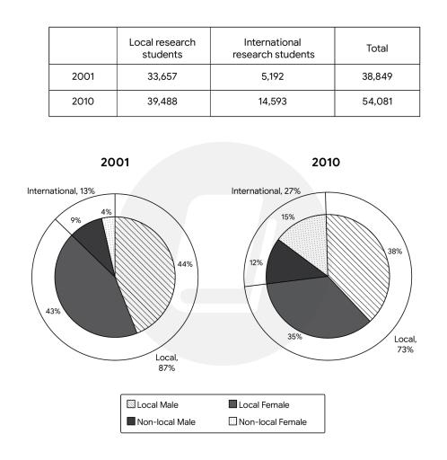
The table below shows the number of research students in Australian universities in 2001 and 2010

A full IELTS Academic Writing Task 1 answer to this mixed / multiple charts at Band 6.0, 7.0, 8.5, with the four-part structure, the comparison language it needs, and why each version scores what it does.

The question

You should spend about 20 minutes on this task.

The table below shows the number of research students in Australian universities in 2001 and 2010.

Summarise the information by selecting and reporting the main features, and make comparisons where relevant.

Write at least 150 words.

A table and two pie charts on research students in Australian universities. The table shows local students rising from 33,657 to 39,488 and international students from 5,192 to 14,593, with totals of 38,849 and 54,081. The pie charts show the international share rising from 13 to 27 per cent, with men outnumbering women in both years.
Numbers and composition of research students in Australian universities, 2001 and 2010.

What to select from this mixed / multiple charts

Two sources of data that answer different questions: the table gives you the scale and the pie charts give you the composition. Use each for what it is good at rather than repeating the same fact twice. The essential point is that local numbers rose while their share fell — which sounds contradictory until you notice the total grew, and explaining that relationship is exactly what a Band 8 answer does.

Structure

Introduction — Paraphrase: what is measured, where, in which two years, and note that both counts and proportions are given.

Overview — No detailed figures: the total grew substantially, driven overwhelmingly by international students, whose share doubled; men outnumbered women throughout.

Body 1 — The table — absolute growth, with the contrast between modest local growth and near-tripling of international numbers.

Body 2 — The pie charts — the resulting shift in composition, and the narrowing gender gap among international students.

Model answers

Band 6.0 model answer

174 words

The table shows the number of research students in Australian universities in 2001 and 2010, and the two pie charts show the percentage of local and international students, divided by gender.

In 2001 there were 33,657 local students and 5,192 international students, so the total was 38,849. In 2010 the number of local students increased to 39,488, and the number of international students increased to 14,593. The total became 54,081.

The pie charts show that in 2001 local students were 87 per cent of all students. Local males were 44 per cent and local females 43 per cent. International students were only 13 per cent, with 9 per cent males and 4 per cent females.

In 2010 the percentage of local students decreased to 73 per cent, with 38 per cent males and 35 per cent females. International students increased to 27 per cent, with 15 per cent males and 12 per cent females.

In conclusion, the number of research students increased in this period, and the percentage of international students became much bigger.

Why this is Band 6.0

  • Both the table and the charts are covered with accurate figures, which secures Task Achievement at this level.
  • The two sources are described one after the other and the relationship between rising numbers and falling share is not explained.
  • Vocabulary is adequate but repetitive, with students, increased and per cent recurring.
  • Sentences are mainly simple and compound, with figures presented one per clause.

Band 7.0 model answer

206 words

The table gives the number of local and international research students at Australian universities in 2001 and 2010, while the two pie charts show how the student body was composed by origin and gender in each year.

Overall, total enrolment grew substantially across the decade, and this growth was driven almost entirely by international students, whose share of the total roughly doubled. Men outnumbered women in both years and among both groups.

The table shows the total rising from 38,849 to 54,081, an increase of around 39 per cent. Local numbers contributed comparatively little to this, growing from 33,657 to 39,488, or about 17 per cent. International enrolment, by contrast, rose from 5,192 to 14,593 — close to three times its original level, and easily outstripping local growth.

This explains the change visible in the pie charts. Although the number of local students rose, their share of the whole fell from 87 to 73 per cent, simply because international numbers grew far faster. International students correspondingly increased from 13 to 27 per cent. Men remained the majority throughout, but the gender gap narrowed among international students, from 9 per cent male against 4 per cent female in 2001 to 15 against 12 per cent in 2010.

Why this is Band 7.0

  • The overview is separate, arrives early and names international growth as the driver of the change.
  • The apparent contradiction between rising local numbers and a falling local share is explained rather than left for the reader.
  • Less common lexis is used accurately: enrolment, composition, outstripped, narrowed.
  • Each source of data is used for a distinct purpose rather than repeating the same information.

Band 8.5 model answer

239 words

The table records the number of local and international research students in Australian universities in 2001 and 2010, while the accompanying pie charts show how that population was composed by origin and sex in each year.

Overall, the research student body expanded considerably over the decade, and virtually all of the additional growth came from overseas. The result was a marked change in composition, with the international share roughly doubling, although men remained the larger group throughout.

In absolute terms the total climbed from 38,849 to 54,081, a rise of around 39 per cent. The two components behaved very differently, however. Local enrolment grew modestly, from 33,657 to 39,488 — an increase of some 17 per cent — whereas international enrolment nearly tripled, from 5,192 to 14,593. Of the roughly 15,200 additional students, more than 9,400 came from overseas, which is why the totals moved as they did.

The pie charts show the consequence, and it is worth stating precisely: the local share fell from 87 to 73 per cent despite local numbers rising, a dilution caused entirely by faster growth elsewhere rather than by any decline. International students accordingly doubled their share to 27 per cent. Within each group men were consistently in the majority, but the imbalance eased among international students, moving from 9 per cent against 4 in 2001 to 15 against 12 in 2010, while the local split remained close to even in both years.

Why this is Band 8.5

  • The overview identifies the driver of change rather than merely reporting that change occurred, and does so without figures.
  • Explicitly resolves the rising-numbers-falling-share relationship, which is the single most common misreading of combined table-and-pie tasks.
  • Uses each data source for what only it can show, so nothing is reported twice.
  • Lexis is precise and economical: composition, outstripped, dilution, near-tripling, marginal.
  • Complex structures are used flexibly, including a concessive clause, an appositive and a participle clause, with figures embedded naturally.

Model answers written and reviewed by The English All-in-One IELTS team. They are teaching models showing what each band looks like, not real candidate scripts.

This is a mixed / multiple charts question. The answers above show you what each band looks like when it is finished. What they cannot show you is how to get there from a blank page in forty minutes.

That is what our Writing Study Library is for: the structure we teach for this exact question type, the paragraph pattern that goes with it, and the sentence openers for each stage — so the essay is planned before you start writing rather than assembled as you go.

See the structure for this question type →

Vocabulary for this topic

Word or phraseMeaningUsed in a sentence
enrolmentthe number of students registered on coursesInternational enrolment nearly tripled over the decade.
compositionwhat a total is made up ofThe pie charts show a marked change in composition.
to outstripto grow much faster than something elseInternational growth easily outstripped local growth.
dilutiona share falling because the total grew, not because the number fellThe fall in the local share was a dilution, not a decline.
in absolute termsas raw numbers rather than percentagesIn absolute terms the total climbed by over 15,000.
to near-tripleto grow to almost three times the originalInternational numbers nearly tripled.
imbalancean unequal split between two groupsThe gender imbalance eased among international students.
componentone of the parts making up a totalThe two components behaved very differently.

Write your own answer

Draft your response below, then get it marked against all four IELTS criteria. Your draft stays in this browser — nothing is published.

Common questions

How can a group's numbers rise while its share falls?

Because the total grew faster. Local students increased by around 5,800 but the total increased by over 15,000, so locals became a smaller slice of a bigger cake. Stating this relationship explicitly is one of the clearest ways to demonstrate that you have understood the data rather than transcribed it.

How do I combine a table with pie charts?

Give each one the job it does best: the table supplies scale and absolute change, the charts supply composition. If you find yourself writing the same fact twice in two forms, you are using them wrong and wasting words.

Should I calculate percentage increases myself?

Simple ones are worth it — "a rise of around 39 per cent", "nearly tripled" — because they turn two numbers into a comparison. Keep them approximate and hedged, and do not attempt anything you cannot do reliably under exam pressure.

Do I need to mention gender if it is a minor feature?

Yes, briefly, since coverage means all the main features and the charts are explicitly split by sex. One sentence noting that men led throughout and that the gap narrowed among international students is proportionate; a paragraph on it would not be.