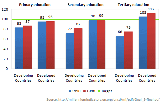
The chart below shows the number of girls per 100 boys enrolled in different levels of school education
A full IELTS Academic Writing Task 1 answer to this bar chart at Band 6.0, 7.0, 8.5, with the four-part structure, the comparison language it needs, and why each version scores what it does.
The question
You should spend about 20 minutes on this task.
The chart below shows the number of girls per 100 boys enrolled in different levels of school education.
Summarise the information by selecting and reporting the main features, and make comparisons where relevant.
Write at least 150 words.
Number of girls per 100 boys enrolled at three levels of education, developing and developed countries, 1990 and 1998, against a target of 100.
What to select from this bar chart
The green line at 100 is the point of the chart: it marks equal enrolment, so every bar should be read as a distance from parity rather than as a bare number. Two patterns matter. In developing countries the shortfall widens as the level of education rises, and in developed countries the reverse happens — they actually pass 100 at tertiary level, meaning more women than men. Both groups improved between the two years.
Structure
Introduction — Paraphrase: what is counted, for which two groups, at which levels, in which years, and note the target line.
Overview — No figures: developed countries were at or above parity throughout while developing countries fell short at every level, with their shortfall widening at higher levels; both improved.
Body 1 — Developing countries — the widening gap from primary to tertiary, and the improvement between years.
Body 2 — Developed countries — near parity at school and above it at tertiary level.
Model answers
Band 6.0 model answer
166 words
The bar chart shows how many girls were in school for every 100 boys in developing and developed countries in 1990 and 1998. The green line shows the target, which is 100.
In primary education, developing countries had 83 girls per 100 boys in 1990 and 87 in 1998. Developed countries were much closer to the target, with 95 in 1990 and 96 in 1998.
In secondary education the difference was bigger. Developing countries had only 72 girls per 100 boys in 1990, but this increased to 82 in 1998. Developed countries had 98 and then 99, so they were almost exactly at the target.
In tertiary education, developing countries had the lowest numbers, 66 in 1990 and 75 in 1998. But developed countries were above the target, with 105 in 1990 and 112 in 1998, so there were more women than men in universities.
In conclusion, developed countries reached the target in all three levels, but developing countries were always below it, especially in universities.
Why this is Band 6.0
All six pairs of bars are covered with accurate figures, which secures Task Achievement at this level.
The target line is mentioned but the bars are reported as numbers rather than as distances from parity.
Vocabulary is adequate but repetitive: girls, boys and increased recur throughout.
Sentences are mainly simple and compound, with one figure per clause.
Band 7.0 model answer
229 words
The bar chart compares the number of girls enrolled per 100 boys at three levels of education in developing and developed countries in 1990 and 1998, measured against a target of 100, which represents equal enrolment.
Overall, developed countries were at or above parity at every level in both years, whereas developing countries fell short throughout. The disparity in developing countries widened as the level of education rose, although all six figures improved between 1990 and 1998.
In developing countries the shortfall was smallest at primary level, where 83 girls were enrolled for every 100 boys in 1990, rising to 87 by 1998. It grew at secondary level, from 72 to 82, and was widest in tertiary education, where only 66 girls per 100 boys were enrolled in 1990. That said, the improvement was greatest precisely where the gap was largest: secondary enrolment gained ten points and tertiary nine, against only four at primary level.
Developed countries showed the reverse pattern. Enrolment was slightly below parity at primary and secondary level, at 95 and 98 in 1990 and 96 and 99 in 1998, so the gap was small and closing. At tertiary level, however, the figure exceeded the target in both years, standing at 105 in 1990 and rising to 112 in 1998 — meaning that women outnumbered men in higher education and did so by an increasing margin.
Why this is Band 7.0
The overview is separate, arrives early and identifies both the shortfall in developing countries and the fact that it widens with the level of education.
The bars are interpreted against the target line rather than reported as raw values.
Comparison language is accurate: parity, fell short of, the reverse, narrowed.
Less common lexis is used accurately: enrolment, disparity, tertiary, closed the gap.
Band 8.5 model answer
264 words
The bar chart compares female enrolment, expressed as the number of girls per 100 boys, across three levels of education in developing and developed countries in 1990 and 1998, against a target of 100 representing equal participation.
Overall, the two groups relate to the target in opposite ways. In developing countries the shortfall grew steadily as the level of education rose, whereas developed countries moved from just below parity at school to well above it at university. Every one of the six figures improved over the eight years.
Developing countries remained below the target at all three levels and in both years. The gap was narrowest in primary education, at 83 girls per 100 boys in 1990 rising to 87 in 1998, and widened progressively thereafter: 72 rising to 82 at secondary level, and 66 rising to 75 at tertiary, the lowest figure anywhere on the chart. The pattern of improvement, however, ran the other way — the largest gains came where the deficit was greatest, with secondary enrolment up ten points and tertiary up nine, against a rise of only four at primary level.
Developed countries were close to parity throughout the school years, at 95 and 98 in 1990 and 96 and 99 in 1998, so their remaining gap was marginal and narrowing. Tertiary education is the one place on the chart where the target is exceeded: female enrolment stood at 105 per 100 males in 1990 and climbed to 112 by 1998, meaning women not only outnumbered men in higher education but widened that lead by seven points over the period.
Why this is Band 8.5
The overview names the opposite relationship between education level and parity in the two groups, which is the structural insight the chart exists to show.
Reads every bar as a distance from the target line rather than as a raw figure, which is what the green line requires.
Notes that developing countries improved most where they were furthest behind — a finding invisible unless the changes are compared with each other.
Lexis is precise and economical: parity, disparity, shortfall, widened, outnumbered, margin.
Complex structures are used flexibly, including a fronted concessive, an appositive and a participle clause, with figures embedded naturally.
Model answers written and reviewed by The English All-in-One IELTS team. They are teaching models showing what each band looks like, not real candidate scripts.
This is a bar chart question. The answers above show you what each band looks like when it is finished. What they cannot show you is how to get there from a blank page in forty minutes.
That is what our Writing Study Library is for: the structure we teach for this exact question type, the paragraph pattern that goes with it, and the sentence openers for each stage — so the essay is planned before you start writing rather than assembled as you go.
Treat it as the reference point for everything. Bars should be described as above, below or level with it rather than as bare numbers, because that is the comparison the chart was drawn to make. Ignoring the line and reporting the values alone misses the point of the task.
How do I explain a figure above 100 here?
State what it means: more girls than boys enrolled. The unit is girls per 100 boys, so 112 means women outnumber men by twelve per hundred. Spelling this out once shows you have understood the measure rather than copied the number.
Should I compare the size of the improvements?
It is one of the strongest observations available. Noting that developing countries gained most where they were furthest behind requires comparing three changes with each other, which is exactly the kind of selection that separates Band 7 and above from a list of figures.
Can I suggest reasons for the gap?
No. Explaining why fewer girls attend university in developing countries is social commentary, not data description, and Task 1 gives no credit for it. Report the pattern and the distances from the target, and stop there.