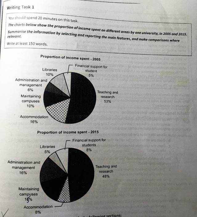
The chart below show the proportion of income spent on different areas by one university, in 2005 and 2015
A full IELTS Academic Writing Task 1 answer to this pie chart at Band 6.0, 7.0, 8.5, with the four-part structure, the comparison language it needs, and why each version scores what it does.
The question
You should spend about 20 minutes on this task.
The chart below show the proportion of income spent on different areas by one university, in 2005 and 2015.
Summarise the information by selecting and reporting the main features, and make comparisons where relevant.
Write at least 150 words.
Proportion of one university's income spent on each area, 2005 and 2015.
What to select from this pie chart
Because these are proportions of a total rather than amounts, every rise is paid for by a fall somewhere else — so the reportable story is what displaced what. Administration nearly tripled while libraries and accommodation each halved, and that transfer is more interesting than the largest slice, which stayed largest in both years. Remember also that a falling percentage does not prove falling spending: if total income grew, a smaller share could still be more money.
Structure
Introduction — Paraphrase: whose income, split across what, in which two years, measured as proportions.
Overview — No figures: teaching and research remained by far the largest area in both years despite falling, while administration grew sharply at the expense of libraries and accommodation.
Body 1 — The categories that fell — teaching and research, accommodation, libraries — with figures at each end.
Body 2 — The categories that rose — administration, campus maintenance, student support — and the resulting change in ranking.
Model answers
Band 6.0 model answer
177 words
The two pie charts show how one university spent its income in 2005 and in 2015. The information is given in percentages.
In 2005, the biggest part of the money, 53 per cent, was spent on teaching and research. Accommodation was the second area with 16 per cent. Libraries and maintaining campuses were both 10 per cent, administration and management was 6 per cent, and financial support for students was only 5 per cent.
In 2015, teaching and research was still the biggest area, but it decreased to 48 per cent. Administration and management increased a lot, from 6 per cent to 16 per cent, and maintaining campuses also increased from 10 per cent to 15 per cent.
On the other hand, accommodation decreased from 16 per cent to only 8 per cent, and libraries decreased from 10 per cent to 5 per cent. Financial support for students increased a little, from 5 per cent to 8 per cent.
In conclusion, the university spent less on teaching, accommodation and libraries in 2015, but much more on administration.
Why this is Band 6.0
All six categories are covered with accurate figures in both years, which secures Task Achievement at this level.
The charts are described one after the other rather than compared, so the reader must work out what changed.
Vocabulary is adequate but repetitive: per cent, spent and university recur throughout.
Sentence structures are mainly simple and compound with limited variation.
Band 7.0 model answer
200 words
The two pie charts compare how one university distributed its income across six areas of spending in 2005 and 2015, expressed as percentages of the total.
Overall, teaching and research remained comfortably the largest area of expenditure in both years, although its share fell. The most striking development was a sharp increase in administrative spending, which came largely at the expense of libraries and accommodation.
Three categories received a smaller share in 2015. Teaching and research declined from 53 to 48 per cent, a modest reduction that nonetheless left it far ahead of everything else. The falls elsewhere were much steeper in relative terms: accommodation halved from 16 to 8 per cent, and libraries also halved, from 10 to 5 per cent, making them the smallest area of spending by the later year.
The remaining three categories all grew. The most dramatic change was in administration and management, which rose from just 6 per cent to 16 per cent — an increase of well over double, and enough to make it the second largest area in 2015. Maintaining campuses rose from 10 to 15 per cent, while financial support for students increased more modestly from 5 to 8 per cent.
Why this is Band 7.0
The overview is separate, arrives early and names the transfer from libraries and accommodation to administration as the main development.
Categories are grouped by direction of change, which produces comparison rather than description.
Comparison language is used accurately — whereas, by contrast, at the expense of, tripled.
Figures are integrated into sentences and the proportional scale of changes is noted, not just the arithmetic difference.
Band 8.5 model answer
236 words
The two pie charts compare the proportion of one university's income allocated to six areas of expenditure in 2005 and in 2015.
Overall, the ranking at the top was unchanged — teaching and research absorbed by far the largest share in both years — but beneath it the distribution was substantially reordered. The defining development was a steep rise in administrative spending, funded in effect by the halving of both library and accommodation budgets.
The reductions were uneven in character. Teaching and research slipped from 53 to 48 per cent, a five-point fall that was proportionally minor and left it more than three times the size of any other category. The other two decreases were far more significant relative to their starting points: accommodation fell from 16 to 8 per cent and libraries from 10 to 5 per cent, each losing exactly half its share, with libraries ending as the smallest item on the chart.
Against these, administration and management rose from 6 to 16 per cent — an increase of ten points that displaced accommodation as the second largest area and represented well over a doubling. Campus maintenance grew from 10 to 15 per cent, while financial support for students climbed more modestly from 5 to 8 per cent. Taken together, the three growing categories gained twenty points, precisely matching what the three declining ones gave up, which is what a chart of proportions requires.
Why this is Band 8.5
The overview selects the two features that matter — continuity at the top, and a substantial internal transfer beneath it — without listing figures.
Recognises that these are shares of a whole, so gains are explicitly framed as being funded by losses elsewhere.
Notes the change in ranking, which is a genuine feature of the data and not visible from any single figure.
Lexis is precise and economical: displaced, at the expense of, reordering, proportionally, marginal.
Complex structures are used flexibly, including a fronted concessive, an appositive and a participle clause, with no strain.
Model answers written and reviewed by The English All-in-One IELTS team. They are teaching models showing what each band looks like, not real candidate scripts.
This is a pie chart question. The answers above show you what each band looks like when it is finished. What they cannot show you is how to get there from a blank page in forty minutes.
That is what our Writing Study Library is for: the structure we teach for this exact question type, the paragraph pattern that goes with it, and the sentence openers for each stage — so the essay is planned before you start writing rather than assembled as you go.
Does a falling percentage mean less money was spent?
Not necessarily, and saying so would be an accuracy error. These are shares of income, so if total income grew, a smaller share could still represent more money. Write about the share unless the chart gives you totals — the safe formulations are "its share fell" or "the proportion allocated to it declined".
Why does it help to note that the gains match the losses?
Because in a chart of proportions they must, and showing that you understand this demonstrates control of the data. It also gives you a genuine comparative sentence rather than another figure, which is exactly what the higher bands reward.
Should I mention that a category stayed the largest?
Yes — continuity is a main feature just as change is. An overview that only reports what moved gives an incomplete picture, and noting that the ranking at the top was unchanged is often the first thing a reader wants to know.
How do I compare six categories without listing them?
Group them by behaviour — those that fell, those that rose — and handle each group in one paragraph. Within a group, lead with the largest or most striking change and cover the rest in a single sentence.