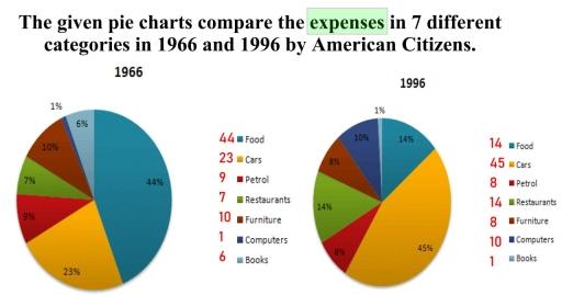
The given pie charts compare the expenses in 7 different categories in 1966 and 1996 by American Citizens. Write a report for a university lecture describing the information below
A full IELTS Academic Writing Task 1 answer to this pie chart at Band 6.0, 7.0, 8.5, with the four-part structure, the comparison language it needs, and why each version scores what it does.
The question
You should spend about 20 minutes on this task.
The given pie charts compare the expenses in 7 different categories in 1966 and 1996 by American Citizens. Write a report for a university lecture describing the information below.
Summarise the information by selecting and reporting the main features, and make comparisons where relevant.
Write at least 150 words.
Proportion of American citizens' expenses in seven categories, 1966 and 1996.
What to select from this pie chart
Seven categories is too many to report one by one, so group them: the pair that swapped places, the pair that changed dramatically in relative terms, and the ones that barely moved. Because these are shares of total spending, every rise is funded by a fall elsewhere — the collapse in food is what pays for the growth in cars. Note that the labels are rounded and do not sum exactly to 100, so approximation language is not optional here.
Structure
Introduction — Paraphrase: whose spending, across how many categories, in which two years, as proportions.
Overview — No figures: food and cars exchanged positions as the largest and second-largest expense, computers emerged as a significant category, and books nearly disappeared.
Body 1 — The dominant pair — food's collapse and the rise of cars — plus restaurants.
Body 2 — The smaller categories — computers up tenfold, books down to almost nothing, furniture and petrol broadly unchanged.
Model answers
Band 6.0 model answer
185 words
The two pie charts show how American citizens spent their money in seven categories in 1966 and in 1996.
In 1966, food was the biggest expense with about 44 per cent. Cars were the second with about 23 per cent, and furniture was about 10 per cent. Petrol was 9 per cent, restaurants 7 per cent, books 6 per cent and computers only 1 per cent.
In 1996 the situation was very different. Food decreased a lot, from 44 per cent to only about 14 per cent. Cars increased from 23 per cent to about 45 per cent, so cars became the biggest expense.
Computers also increased a lot, from only 1 per cent to about 10 per cent. Restaurants increased from 7 per cent to about 14 per cent, so they doubled.
Books decreased from 6 per cent to only 1 per cent. Furniture stayed the same at about 10 per cent, and petrol was almost the same, 9 per cent and then 8 per cent.
In conclusion, Americans spent much less on food and much more on cars in 1996 than in 1966.
Why this is Band 6.0
All seven categories are covered for both years with accurate figures, which secures Task Achievement at this level.
The categories are worked through in order rather than grouped, so the reader must identify the pattern.
Vocabulary is adequate but repetitive: per cent, increased and decreased do most of the work.
Sentences are mainly simple and compound, with one figure per clause.
Band 7.0 model answer
208 words
The two pie charts compare how American citizens divided their expenditure across seven categories in 1966 and 1996.
Overall, food and cars exchanged positions, with cars displacing food as by far the largest single expense. Computers emerged from almost nothing to become a significant category, while spending on books moved in the opposite direction.
The dominant change involved the two largest items. Food, which absorbed approximately 44 per cent of spending in 1966, fell to around 14 per cent thirty years later — a loss of some thirty percentage points, or roughly two thirds of its original share. Cars moved almost exactly the other way, rising from about 23 to 45 per cent, so what had been the second category became comfortably the first. Restaurants also grew substantially, roughly doubling from 7 to around 14 per cent.
Among the smaller categories, the most striking movement was in computers, which rose from a negligible 1 per cent to approximately 10 per cent — a tenfold increase, although small in absolute points. Books declined from about 6 per cent to only 1 per cent, becoming the smallest category by 1996. Furniture was unchanged at around 10 per cent, and petrol altered only marginally, from roughly 9 to 8 per cent.
Why this is Band 7.0
The overview is separate, arrives early and names the exchange between food and cars as the defining change.
Categories are grouped by behaviour rather than listed, which produces comparison.
Proportional change is distinguished from percentage-point change, particularly for computers and books.
Less common lexis is used accurately: displaced, tenfold, marginal, at the expense of.
Band 8.5 model answer
282 words
The two pie charts compare the proportion of American citizens' expenditure devoted to seven categories in 1966 and in 1996. The figures are rounded, so they do not sum precisely to one hundred.
Overall, the ranking of expenses was substantially reordered over the thirty years. Food and cars exchanged first and second place, and at the smaller end of the scale computers appeared as a meaningful category while books almost vanished. Only furniture and petrol were essentially unchanged.
The reordering at the top accounts for most of the movement. Food, comfortably the largest expense in 1966 at approximately 44 per cent, had contracted to around 14 per cent by 1996 — a fall of some thirty points, which removed close to two thirds of its share. Cars rose by almost precisely the same margin, from about 23 to 45 per cent, so the growth in motoring costs was funded, in proportional terms, almost entirely at the expense of food. Restaurant spending doubled over the same period, from roughly 7 to 14 per cent, which suggests that part of the reduction in food spending reflects a change in where meals were eaten rather than a reduction in eating.
The smaller categories show two opposite extremes. Computers grew from a residual 1 per cent to approximately 10 per cent — modest in absolute points but a tenfold expansion, and the appearance of an entirely new spending category. Books moved the other way, from about 6 per cent down to 1 per cent, ending as the smallest item on the chart. Against these, furniture held steady at around 10 per cent in both years and petrol shifted only from roughly 9 to 8 per cent.
Why this is Band 8.5
The overview selects the exchange at the top and the emergence and near-disappearance at the bottom, giving the whole chart a shape.
Explicitly frames the data as shares of a whole, so the fall in food is presented as funding the rise in cars.
Handles proportional versus absolute change precisely, and flags the rounding in the source rather than asserting a false total.
Lexis is precise and economical: displaced, at the expense of, tenfold, residual, reordering.
Complex structures are used flexibly, with a fronted adverbial, an appositive and a participle clause, and figures embedded naturally.
Model answers written and reviewed by The English All-in-One IELTS team. They are teaching models showing what each band looks like, not real candidate scripts.
This is a pie chart question. The answers above show you what each band looks like when it is finished. What they cannot show you is how to get there from a blank page in forty minutes.
That is what our Writing Study Library is for: the structure we teach for this exact question type, the paragraph pattern that goes with it, and the sentence openers for each stage — so the essay is planned before you start writing rather than assembled as you go.
Note it in one clause — "the figures are rounded" — and use approximation language throughout. Silently asserting a total that the chart does not support is an accuracy error, whereas acknowledging the rounding shows you read the data carefully.
Is a rise from 1 to 10 per cent big or small?
Both, and saying so is what earns the mark. It is only nine percentage points, but it is a tenfold increase and represents a category that barely existed becoming a significant one. Judging significance by proportion as well as by size is exactly the discrimination the higher bands reward.
Should I suggest reasons for the changes?
No. Task 1 asks you to report, and explaining why Americans spent less on food would be speculation. The Band 8.5 model comes close by linking the food fall to the restaurant rise, but that is a comparison between two figures on the chart, not an outside explanation.
How do I handle seven categories without listing them?
Group them into three: the ones that changed places, the ones that changed dramatically in relative terms, and the ones that stayed still. The last group can be covered in a single sentence, which frees words for the comparisons that matter.