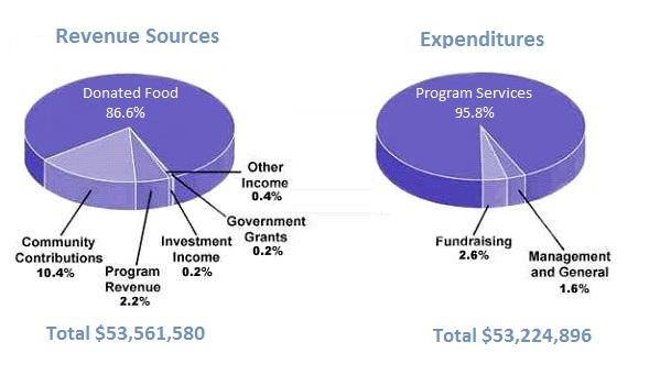
The pie chart shows the amount of money that a children’s charity located in the USA spent and received in one year
A full IELTS Academic Writing Task 1 answer to this pie chart at Band 6.0, 7.0, 8.5, with the four-part structure, the comparison language it needs, and why each version scores what it does.
The question
You should spend about 20 minutes on this task.
The pie chart shows the amount of money that a children’s charity located in the USA spent and received in one year.
Summarise the information by selecting and reporting the main features, and make comparisons where relevant.
Write at least 150 words.
Sources of revenue and areas of expenditure for a children's charity in the USA over one year.
What to select from this pie chart
Both charts are dominated by a single slice, which makes selection easy and the trap obvious: there is very little to say about the tiny categories, so candidates pad by listing every one of them. The genuinely interesting features are that the two totals are almost identical — income barely exceeded spending — and that the dominant slice on each side is of a completely different kind, since donated food is goods rather than cash. Comparing the two charts rather than describing them in turn is what earns the marks here.
Structure
Introduction — Paraphrase: what the two charts show, for which organisation, over what period, and note the totals are given in dollars.
Overview — No detailed figures: each chart is dominated by one category, and total income and total expenditure were almost the same, leaving only a small surplus.
Body 1 — Revenue — donated food overwhelming, community contributions a distant second, everything else negligible.
Body 2 — Expenditure — program services taking almost everything, with fundraising and administration between them under five per cent.
Model answers
Band 6.0 model answer
158 words
The two pie charts show where a children's charity in the USA received its money and how it spent this money during one year.
The first chart shows the sources of the money. The biggest source was donated food, which was 86.6 per cent of all the revenue. The second source was community contributions with 10.4 per cent. After that, program revenue was 2.2 per cent, other income was 0.4 per cent, and investment income and government grants were both only 0.2 per cent.
The second chart shows the expenditure. Almost all the money, 95.8 per cent, was spent on program services. Fundraising took 2.6 per cent and management and general took 1.6 per cent.
The total revenue was $53,561,580 and the total expenditure was $53,224,896, so the charity received a little more money than it spent.
In conclusion, this charity received most of its money as donated food and spent almost all of it on its programmes.
Why this is Band 6.0
Both charts are covered with accurate figures, which secures the basis of Task Achievement.
The charts are described one after the other, and every small category is listed, so selection is weak.
Vocabulary is adequate but repetitive, with per cent and money recurring throughout.
Sentence structures are simple and compound, with figures presented one per clause.
Band 7.0 model answer
192 words
The two pie charts show the sources of income and the areas of expenditure for a children's charity based in the USA over a single year, together with the totals in US dollars.
Overall, both sides of the charity's finances were dominated by a single category, and the organisation spent very nearly everything it received, ending the year with only a marginal surplus.
On the revenue side, donated food was overwhelmingly the largest source, accounting for 86.6 per cent of a total of $53,561,580. Community contributions formed a distant second at 10.4 per cent, and program revenue provided a further 2.2 per cent. The three remaining sources — other income, investment income and government grants — were negligible, together contributing less than one per cent of the total.
Expenditure was even more concentrated. Program services absorbed 95.8 per cent of the $53,224,896 spent, leaving only 4.2 per cent for everything else: 2.6 per cent went on fundraising and 1.6 per cent on management and general costs. Since total spending fell only around $337,000 short of total income, the charity effectively distributed almost all of the resources it received within the same year.
Why this is Band 7.0
The overview is separate, arrives early and identifies the two-way dominance and the near-balance of the totals.
The small categories are grouped and dismissed together rather than listed individually, which is proper selection.
Less common lexis is used accurately: accounted for, negligible, surplus, combined.
A range of structures with figures embedded into sentences rather than stacked.
Band 8.5 model answer
202 words
The two pie charts compare the sources of a US children's charity's income with the areas of its expenditure over one year, with totals given in dollars.
Overall, each chart is dominated by a single category to an unusual degree, and the two totals are almost identical, meaning the organisation disbursed virtually everything it took in. Notably, the largest source of income was not cash at all.
Income of $53,561,580 came overwhelmingly from donated food, which alone represented 86.6 per cent of the total. Community contributions were the only other meaningful source at 10.4 per cent, with program revenue adding 2.2 per cent. Government grants, investment income and other income were together worth under one per cent — a striking figure in itself, since it indicates the charity operated with virtually no public funding.
Expenditure was more concentrated still. Program services accounted for 95.8 per cent of the $53,224,896 spent, leaving fundraising at 2.6 per cent and management at 1.6 per cent, so total overheads came to just 4.2 per cent. With outgoings only some $337,000 below income — a difference of well under one per cent — the charity essentially passed on everything it received in the year it received it.
Why this is Band 8.5
The overview selects the two defining features — single-category dominance on each side, and the near-identical totals — without descending into figures.
Groups the trivial categories in a single clause, which is disciplined selection rather than omission, and spends the space on comparison instead.
Draws a genuine comparison the reader could not make from the charts alone: the near-balance of the totals, and the low proportion spent on overheads.
Lexis is precise and economical: overwhelmingly, negligible, overheads, marginal, concentrated, with accurate hedging.
Structures are varied and controlled, including a fronted adverbial and an appositive, with figures integrated naturally.
Model answers written and reviewed by The English All-in-One IELTS team. They are teaching models showing what each band looks like, not real candidate scripts.
This is a pie chart question. The answers above show you what each band looks like when it is finished. What they cannot show you is how to get there from a blank page in forty minutes.
That is what our Writing Study Library is for: the structure we teach for this exact question type, the paragraph pattern that goes with it, and the sentence openers for each stage — so the essay is planned before you start writing rather than assembled as you go.
No. Grouping the small ones — "the remaining three sources together contributed under one per cent" — is proper selection and reads far better than listing six figures individually. Task Achievement rewards choosing what matters, not exhaustiveness.
Can I compare the two totals?
Yes, and here you should: the fact that income and expenditure were within about $337,000 of each other is one of the most reportable features of the charts and is not visible from the percentages alone. Comparing given totals is reporting the data, not interpreting it.
What if two pie charts show different things rather than two time periods?
Then compare their <em>structure</em> rather than tracking change: which is more concentrated, whether the dominant categories are of a similar kind, how the totals relate. Trying to describe them as before-and-after when they are not will produce inaccurate comparisons.
Is it acceptable to point out something the chart implies?
Only where it follows directly from the figures, such as noting that under one per cent from government grants means the charity was almost entirely privately funded. Speculating about why that is the case would be going beyond the data.