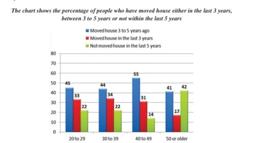
The bar chart shows the percentage of people who have moved house either in last 3 years,between 3years to 5 years,not within the last 5 years
A full IELTS Academic Writing Task 1 answer to this bar chart at Band 6.0, 7.0, 8.5, with the four-part structure, the comparison language it needs, and why each version scores what it does.
The question
You should spend about 20 minutes on this task.
The bar chart shows the percentage of people who have moved house either in last 3 years,between 3years to 5 years,not within the last 5 years.
Summarise the information by selecting and reporting the main features, and make comparisons where relevant.
Write at least 150 words.
Percentage of people who have moved house in the last 3 years, 3 to 5 years ago, or not within the last 5 years, by age group.
What to select from this bar chart
Three bars per group, and the pattern runs cleanly across the age bands: recent movers decline with age while non-movers rise, and the two lines effectively cross in the oldest group. The 40 to 49 band is the one that breaks the neatness — it has the highest figure anywhere for moving 3 to 5 years ago and the lowest for not moving at all — and noticing that exception is what lifts the answer.
Structure
Introduction — Paraphrase: what is measured, in which three categories, across which age groups.
Overview — No figures: moving becomes less common with age, so recent movers decline steadily while those who have not moved in five years rise, overtaking them in the oldest group.
Body 1 — The two trends running across the age bands — recent moves falling, non-movers rising.
Body 2 — The middle category and the 40 to 49 anomaly.
Model answers
Band 6.0 model answer
213 words
The bar chart shows the percentage of people in four age groups who moved house recently or did not move for a long time.
In the group 20 to 29, 45 per cent moved 3 to 5 years ago and 33 per cent moved in the last 3 years. Only 22 per cent did not move in the last 5 years.
In the group 30 to 39 the numbers were similar. 44 per cent moved 3 to 5 years ago, 34 per cent moved in the last 3 years and 22 per cent did not move.
In the group 40 to 49, 55 per cent moved 3 to 5 years ago, which is the highest number in the chart. 31 per cent moved in the last 3 years and only 14 per cent did not move, which is the lowest number.
In the group 50 or older the situation was different. Only 17 per cent moved in the last 3 years, and 42 per cent did not move in the last 5 years, which is more than the people who moved 3 to 5 years ago, 41 per cent.
In conclusion, young people moved house more often than older people, and older people usually stayed in the same house for a long time.
Why this is Band 6.0
All four age groups and all three categories are covered with accurate figures, which secures Task Achievement at this level.
The chart is described group by group rather than by trend, so the pattern across ages emerges only at the end.
Vocabulary is adequate but repetitive: per cent, moved and people recur throughout.
Sentences are mainly simple and compound, with one figure per clause.
Band 7.0 model answer
256 words
The bar chart compares the proportion of people in four age groups who had moved house within the last three years, three to five years previously, or not at all in the last five years.
Overall, recent moving becomes progressively less common with age, while the proportion of people who have stayed put rises correspondingly. Among those aged 50 and over the two are reversed, with non-movers outnumbering those who moved three to five years ago.
The clearest trend concerns the two extremes. The share who had moved within the last three years fell steadily across the age bands, from 33 per cent of 20 to 29 year olds and 34 per cent of those in their thirties to 31 per cent of 40 to 49 year olds and just 17 per cent of the over-50s. Those who had not moved in five years moved in the opposite direction, rising from 22 per cent in each of the two youngest groups to 42 per cent among the oldest — nearly double.
The middle category is less regular. Around 45 per cent of 20 to 29 year olds and 44 per cent of those in their thirties had moved three to five years earlier, but the figure rose sharply to 55 per cent among 40 to 49 year olds, the highest single value on the chart, before falling back to 41 per cent. This same age group also recorded the lowest proportion of non-movers at only 14 per cent, making it the exception to the general pattern.
Why this is Band 7.0
The overview is separate, arrives early and identifies the opposing trends across the age bands.
The chart is described by category across the age groups rather than group by group, which produces comparison.
The 40 to 49 anomaly is identified rather than buried in the sequence.
Less common lexis is used accurately: declined steadily, overtook, the exception, correspondingly.
Band 8.5 model answer
285 words
The bar chart compares how recently people in four age groups had moved house, distinguishing those who moved within the last three years, those who moved three to five years ago, and those who had not moved within five years.
Overall, residential mobility declines with age: the proportion who had moved recently falls across the age bands while the proportion who had not moved at all rises, and among those aged 50 and over the second overtakes the first. One age group, the 40 to 49 band, departs from this pattern on two counts.
The two outer categories move in mirror image. Recent movers accounted for roughly a third of people in the three younger bands — 33, 34 and 31 per cent respectively — before dropping sharply to 17 per cent among the over-50s, roughly half the level of the youngest group. Those who had not moved in five years followed the reverse path, holding at 22 per cent in both the twenties and thirties, dipping to 14 per cent among 40 to 49 year olds, and then almost doubling to 42 per cent in the oldest band, where they became the largest of the three categories.
The middle category supplies the anomaly. Between 44 and 45 per cent of people in their twenties and thirties had moved three to five years earlier, but the figure jumped to 55 per cent among 40 to 49 year olds — the highest value anywhere on the chart — before falling to 41 per cent. That the same age group also recorded the lowest proportion of non-movers means it was the most mobile of the four overall, despite sitting between two less mobile bands on either side.
Why this is Band 8.5
The overview names the opposing trends and the crossover in the oldest group, which is the structure of the chart.
Reads the chart by category across the age bands rather than group by group, so every sentence compares.
Identifies the 40 to 49 band as an anomaly on two separate measures, which no single bar reveals.
Lexis is precise and economical: steadily, correspondingly, anomaly, overtook, mobility.
Complex structures are used flexibly, including a fronted concessive, an appositive and a participle clause, with figures embedded naturally.
Model answers written and reviewed by The English All-in-One IELTS team. They are teaching models showing what each band looks like, not real candidate scripts.
This is a bar chart question. The answers above show you what each band looks like when it is finished. What they cannot show you is how to get there from a blank page in forty minutes.
That is what our Writing Study Library is for: the structure we teach for this exact question type, the paragraph pattern that goes with it, and the sentence openers for each stage — so the essay is planned before you start writing rather than assembled as you go.
Should I describe each age group or each category?
Each category, across the groups. Describing group by group produces four self-contained paragraphs and no trend; following one bar across all four ages lets you say it rises or falls, which is what the chart is showing.
What do I do with a group that breaks the pattern?
Give it its own treatment after establishing the pattern. The 40 to 49 band is both the highest on one measure and the lowest on another, which makes it genuinely reportable — and identifying an exception is a clear marker of good selection.
Do these three bars add up to 100 per cent?
They should, since the categories are exhaustive, and they roughly do. That means you can treat one figure as implying the others, but check before relying on it — and there is no need to state all three when two make the point.
Can I explain why older people move less?
No. The chart records the pattern, not its causes, and offering reasons about mortgages or family life would be speculation. Describe the trend, note the exception, and stop.