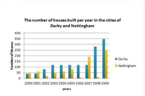
The bar chart below shows the number of houses built per year in two cities, Derby and Nottingham, Between 2000 and 2009. Write a report for a university lecturer describing the information shown below
A full IELTS Academic Writing Task 1 answer to this bar chart at Band 6.0, 7.0, 8.5, with the four-part structure, the comparison language it needs, and why each version scores what it does.
The question
You should spend about 20 minutes on this task.
The bar chart below shows the number of houses built per year in two cities, Derby and Nottingham, Between 2000 and 2009. Write a report for a university lecturer describing the information shown below.
Summarise the information by selecting and reporting the main features, and make comparisons where relevant.
Write at least 150 words.
Number of houses built per year in Derby and Nottingham, 2000–2009.
What to select from this bar chart
The reportable contrast is not which city built more but how differently they behaved: Derby follows a clear, staged trend while Nottingham swings violently from year to year with no direction at all. Describing Nottingham as simply rising or falling would misrepresent it. The word to reach for is volatility, and locating the extreme swings — 2006 to 2007 to 2008 — is what makes the description accurate.
Structure
Introduction — Paraphrase: what is counted, in which two cities, over what period.
Overview — No figures: Derby rose steadily and finished far higher than it began, whereas Nottingham fluctuated erratically with no trend; both reached their highest levels in the final year.
Body 1 — Derby — the three phases of its rise, with figures.
Body 2 — Nottingham — the volatility, with the extreme swings identified, and the comparison between the cities.
Model answers
Band 6.0 model answer
192 words
The bar chart shows how many houses were built every year in two cities, Derby and Nottingham, between 2000 and 2009.
In Derby the number increased almost every year. In 2000 it was only about 40 houses, and in 2002 it was about 78. From 2003 to 2007 the number stayed at about 120 houses every year. After that it increased very quickly to about 280 in 2008 and about 348 in 2009.
In Nottingham the numbers were very different every year. In 2000 it was about 45 houses and in 2001 about 62, but in 2002 it fell to only 22. Then it increased again to about 48 in 2003, 58 in 2004 and 80 in 2005.
In 2006 the number fell to only about 8 houses, which was the lowest number in the chart. In 2007 it increased to about 192, but in 2008 it fell again to about 15. In 2009 it increased to about 250, which was the highest number for Nottingham.
In conclusion, Derby built more houses almost every year and its numbers increased regularly, but the numbers in Nottingham changed a lot from year to year.
Why this is Band 6.0
Both cities are covered with accurate figures at the key points, which secures Task Achievement at this level.
Nottingham's irregularity is reported year by year rather than characterised, so the essay lists rather than describes.
Vocabulary is adequate but repetitive: increased, decreased and houses recur throughout.
Sentences are mainly simple and compound, with one figure per clause.
Band 7.0 model answer
217 words
The bar chart compares the number of houses constructed each year in Derby and Nottingham between 2000 and 2009.
Overall, the two cities behaved in completely different ways. Derby followed a clear upward trend across the decade, whereas Nottingham fluctuated erratically from year to year with no discernible direction. Both nevertheless reached their highest figures in the final year.
Derby's growth came in three distinct phases. Construction began at a low level of around 40 houses in 2000 and rose gradually to about 78 by 2002. It then reached a plateau, holding close to 120 houses annually for five consecutive years to 2007. The final two years brought a sharp acceleration, with output more than doubling to roughly 280 in 2008 and rising again to approximately 348 in 2009 — almost nine times the figure at the start of the period.
Nottingham showed no comparable pattern. Its output swung violently between adjacent years: from about 80 houses in 2005 down to only 8 in 2006, up to roughly 192 in 2007, back down to around 15 in 2008, and finally up to about 250 in 2009. The extremes of this series are separated by more than 240 houses within the space of four years, and Derby exceeded Nottingham in every year from 2002 onwards apart from 2007.
Why this is Band 7.0
The overview is separate, arrives early and contrasts a steady trend with an erratic one — the correct characterisation of the two series.
Derby's rise is described in phases rather than year by year, which is proper selection.
Nottingham's behaviour is characterised as volatile and then illustrated with the extreme swings, rather than being listed exhaustively.
Less common lexis is used accurately: volatile, plateau, erratic, swung.
Band 8.5 model answer
264 words
The bar chart compares annual house construction in the cities of Derby and Nottingham over the ten years from 2000 to 2009.
Overall, the striking difference between the two is one of behaviour rather than of scale. Derby followed a coherent upward trajectory throughout, while Nottingham's output oscillated so sharply between consecutive years that no trend can be identified at all. The two nevertheless converged at the end, both recording their highest figures in 2009.
Derby's increase falls into three clear phases. From a starting point of roughly 40 houses in 2000, construction climbed modestly to about 78 by 2002. It then settled onto a plateau, remaining within a few houses of 120 every year from 2003 to 2007 — five years of almost complete stability. The pattern broke in the final two years, when output more than doubled to approximately 280 in 2008 and reached some 348 in 2009, close to nine times the level at which the decade began.
Nottingham's figures are best described by their volatility. The city built around 80 houses in 2005, then just 8 in 2006, before jumping to roughly 192 in 2007 and collapsing again to about 15 in 2008 — three reversals of direction in as many years, with individual swings exceeding 180 houses. Its final figure of approximately 250 in 2009 was its highest of the decade, but given the preceding pattern it reads as another swing rather than the culmination of a trend. Derby produced more houses in every year from 2002 onwards with the single exception of 2007, when Nottingham briefly overtook it.
Why this is Band 8.5
The overview identifies the difference in behaviour rather than in quantity, which is the genuinely reportable feature of this chart.
Derby is described in phases and Nottingham by its volatility, so each series is characterised in the way its data actually warrants.
Quantifies the volatility explicitly — the size of the year-on-year swings — instead of merely calling it irregular.
Lexis is precise and economical: volatility, plateau, trajectory, year on year, converged.
Complex structures are used flexibly, including a fronted concessive, an appositive and a participle clause, with figures embedded naturally.
Model answers written and reviewed by The English All-in-One IELTS team. They are teaching models showing what each band looks like, not real candidate scripts.
This is a bar chart question. The answers above show you what each band looks like when it is finished. What they cannot show you is how to get there from a blank page in forty minutes.
That is what our Writing Study Library is for: the structure we teach for this exact question type, the paragraph pattern that goes with it, and the sentence openers for each stage — so the essay is planned before you start writing rather than assembled as you go.
Name the behaviour rather than forcing a direction. Words like <em>volatile</em>, <em>erratic</em> and <em>fluctuated sharply</em> describe Nottingham accurately, whereas saying it "generally increased" would be false. Then illustrate with the two or three most extreme swings instead of listing every year.
Should I report every year for a ten-year chart?
No. Group the years into phases where the behaviour is consistent — Derby has three — and give figures at the boundaries. Reporting twenty numbers uses all your words and shows no selection, which is a marked criterion.
Is it worth saying which city built more overall?
A comparison of that kind is useful, but be precise: saying Derby led in every year from 2002 except 2007 is accurate and informative, whereas "Derby built more houses" glosses over the year Nottingham overtook it.
Can I comment on whether the 2009 figure is a real trend?
You can note that it follows a pattern of swings, which is a description of the data. What you should not do is predict what happened next or explain the construction industry — both go beyond what the chart shows.